Bold identities
and digital
experiences.
I'm a Brussels-based designer creating bold identities and digital experiences through creative direction, strategy, branding and UX/UI with AI used where it truly adds value. My background blends agency, freelance and leadership experience across culture, music, corporate and non-profit projects.
Moirés
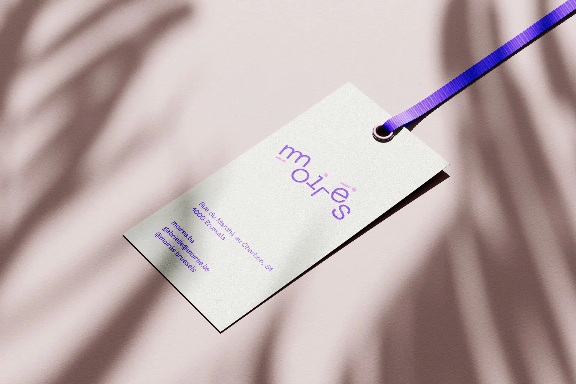
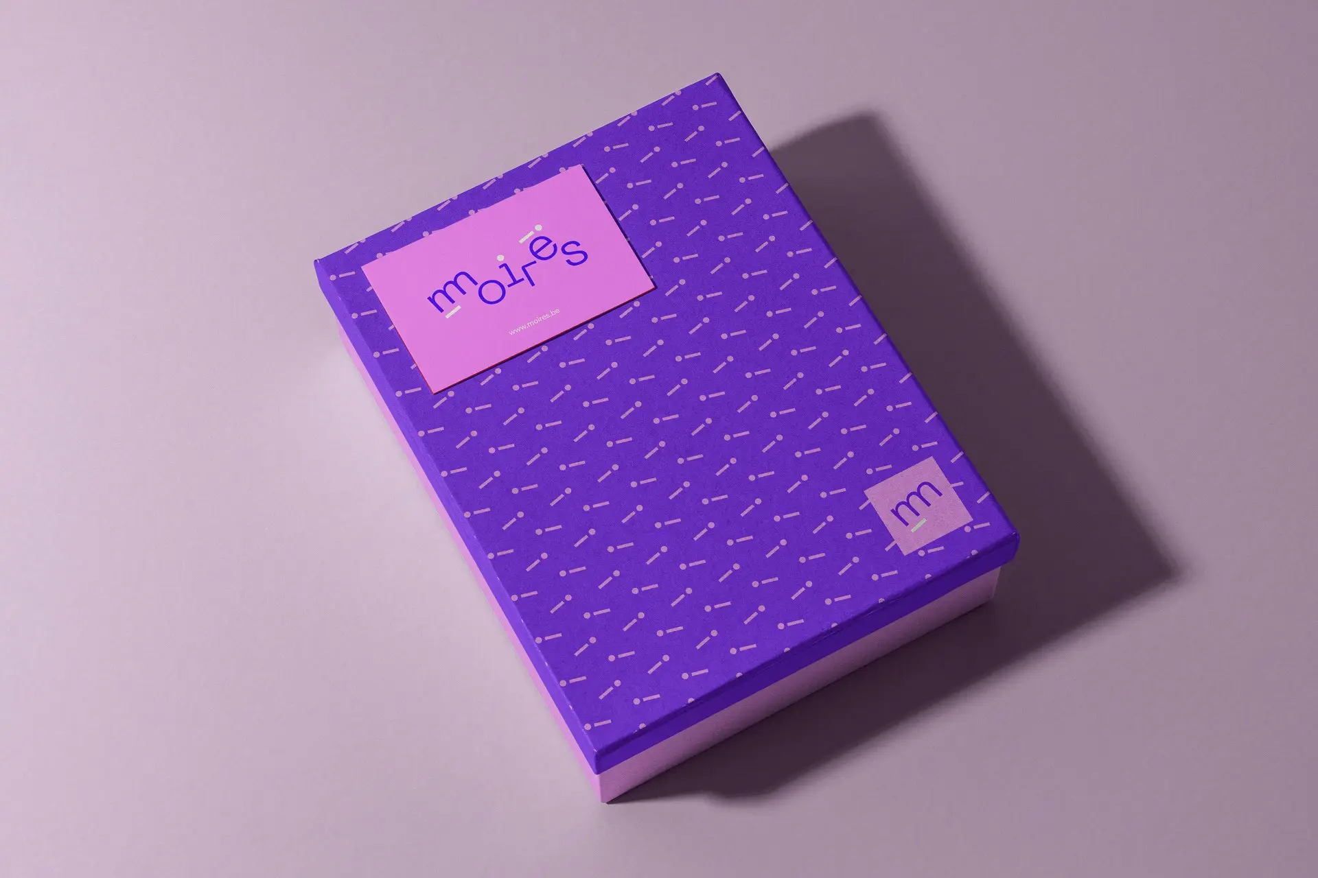
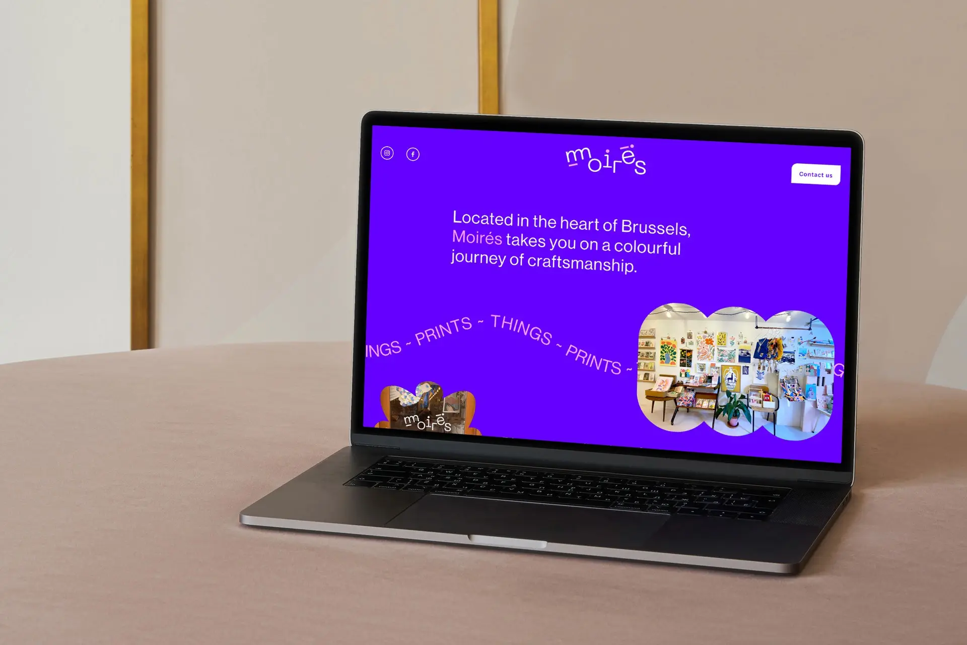
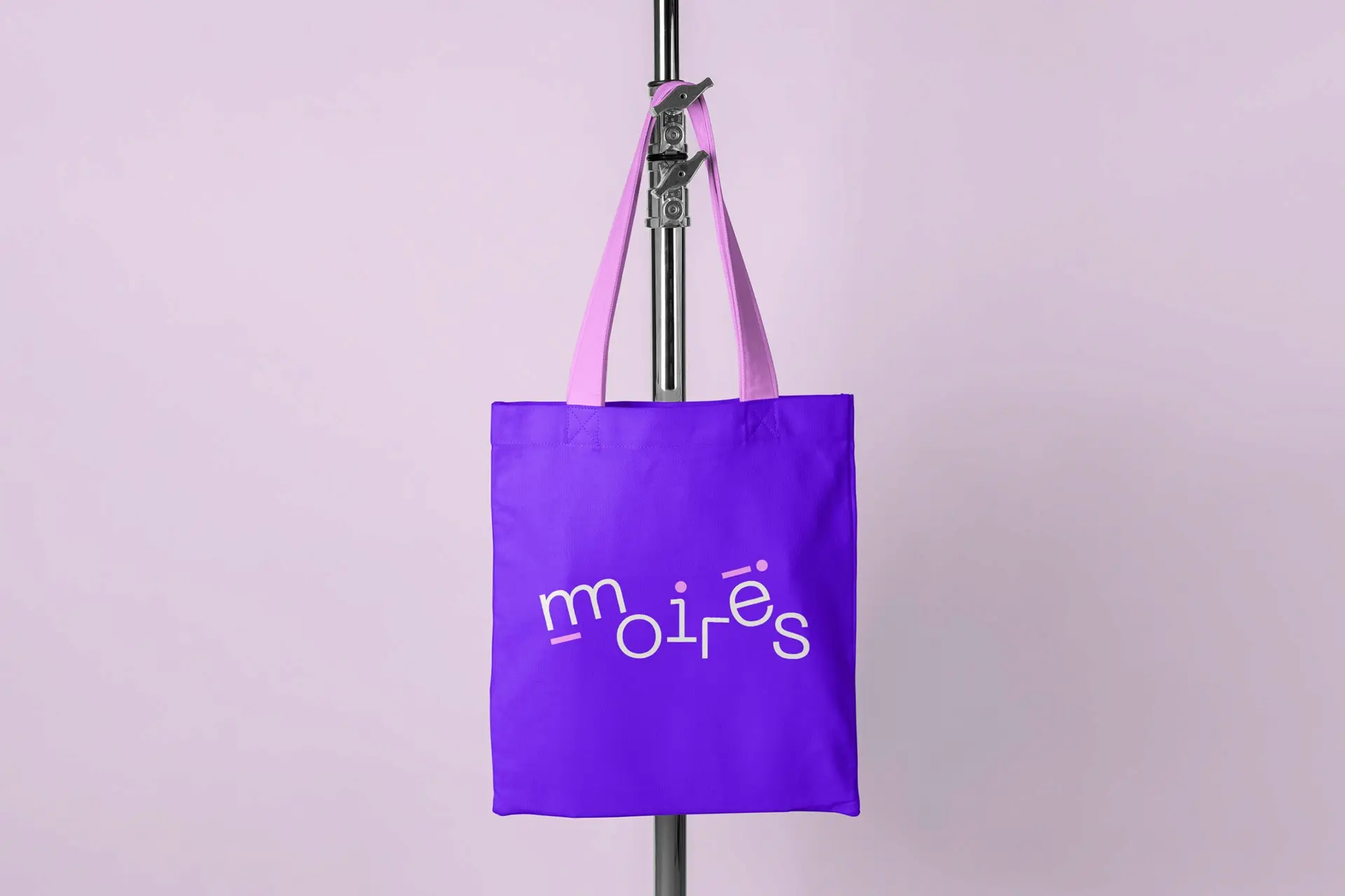
Identity for a Brussels shop selling prints, stationery and handmade objects. The name comes from the optical effect that appears when two similar patterns overlap, so the wordmark is set against its own reflection, two purples slightly out of register, and the shimmer does the rest.
Nada Booking
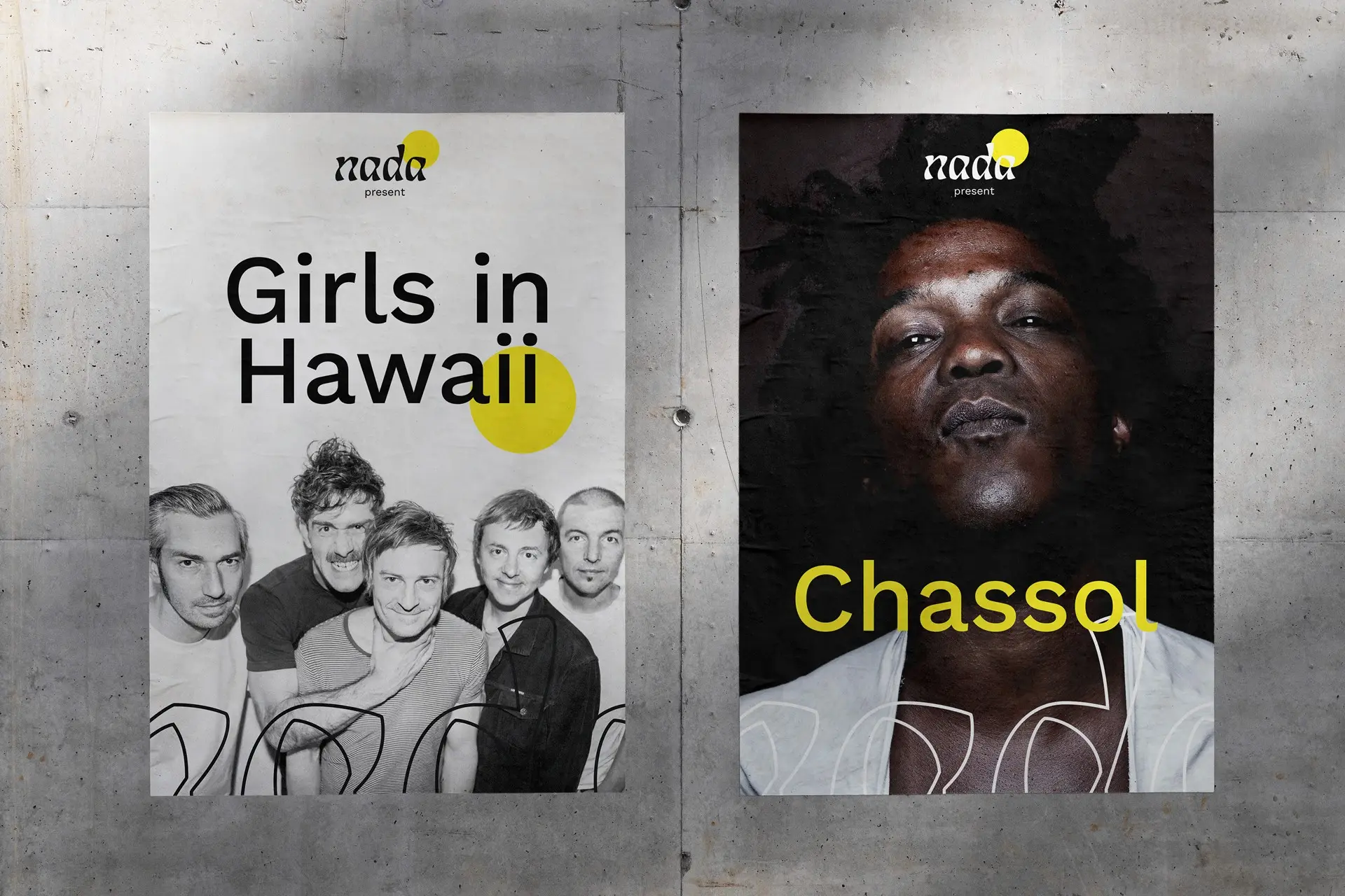
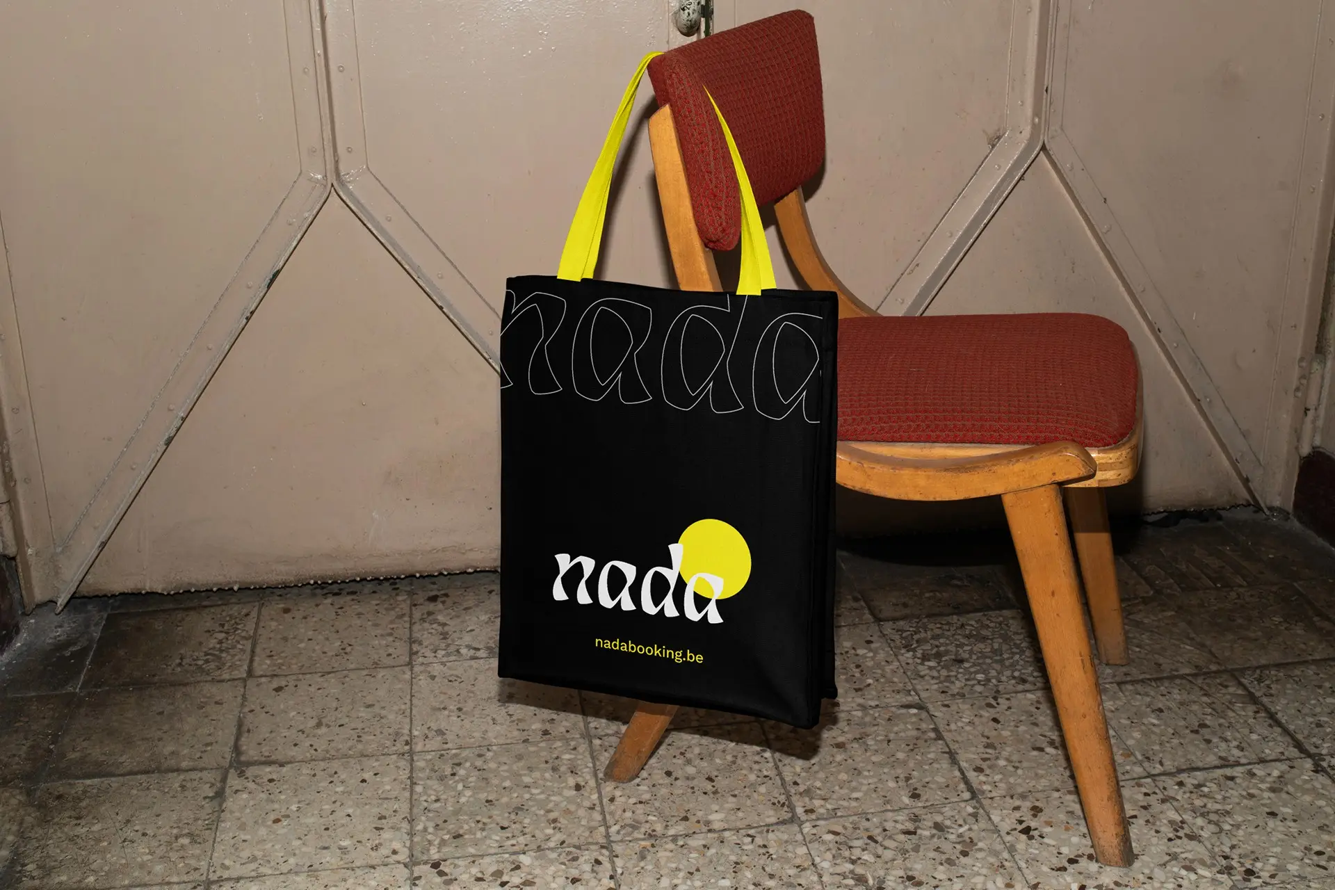
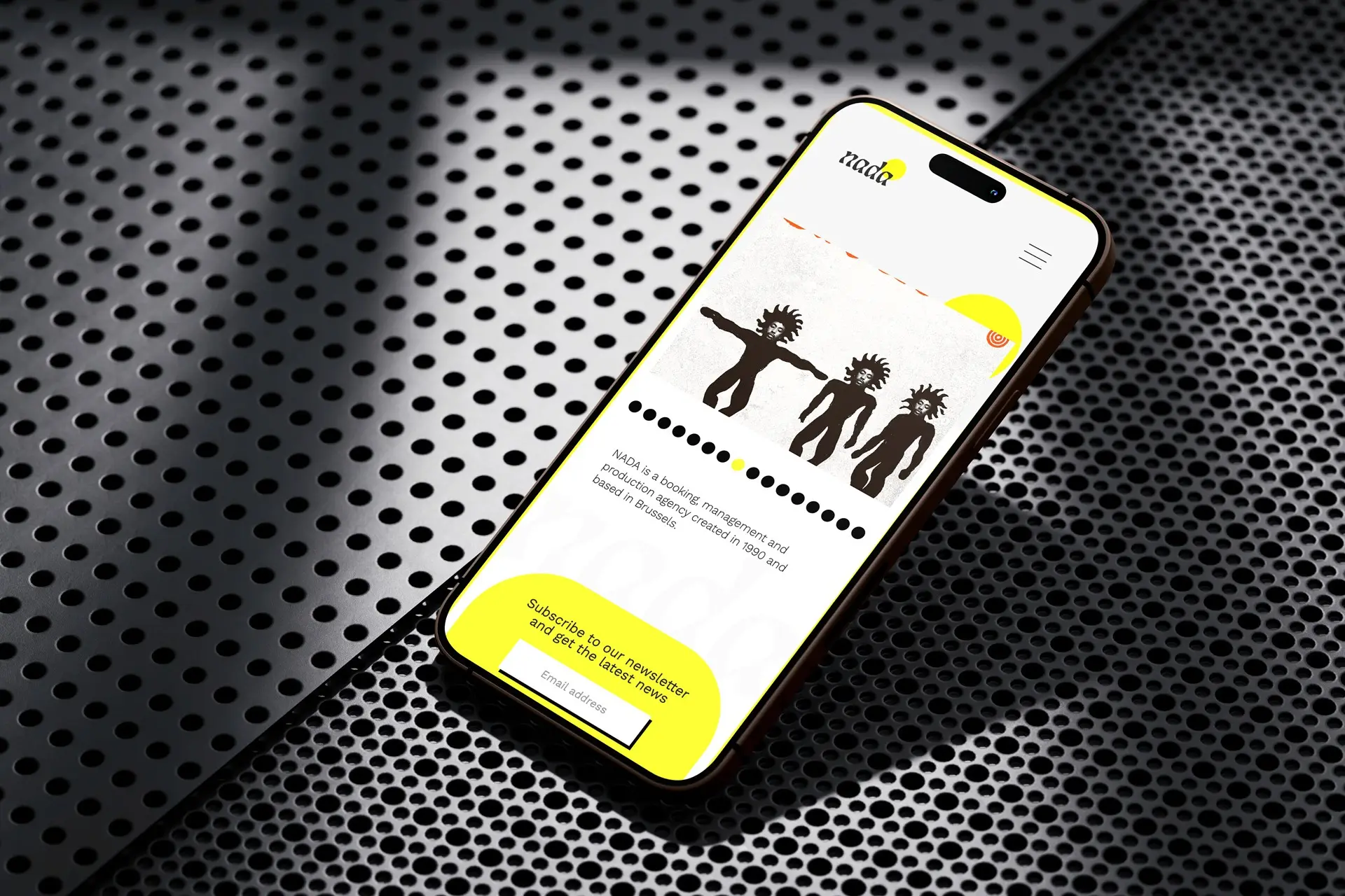
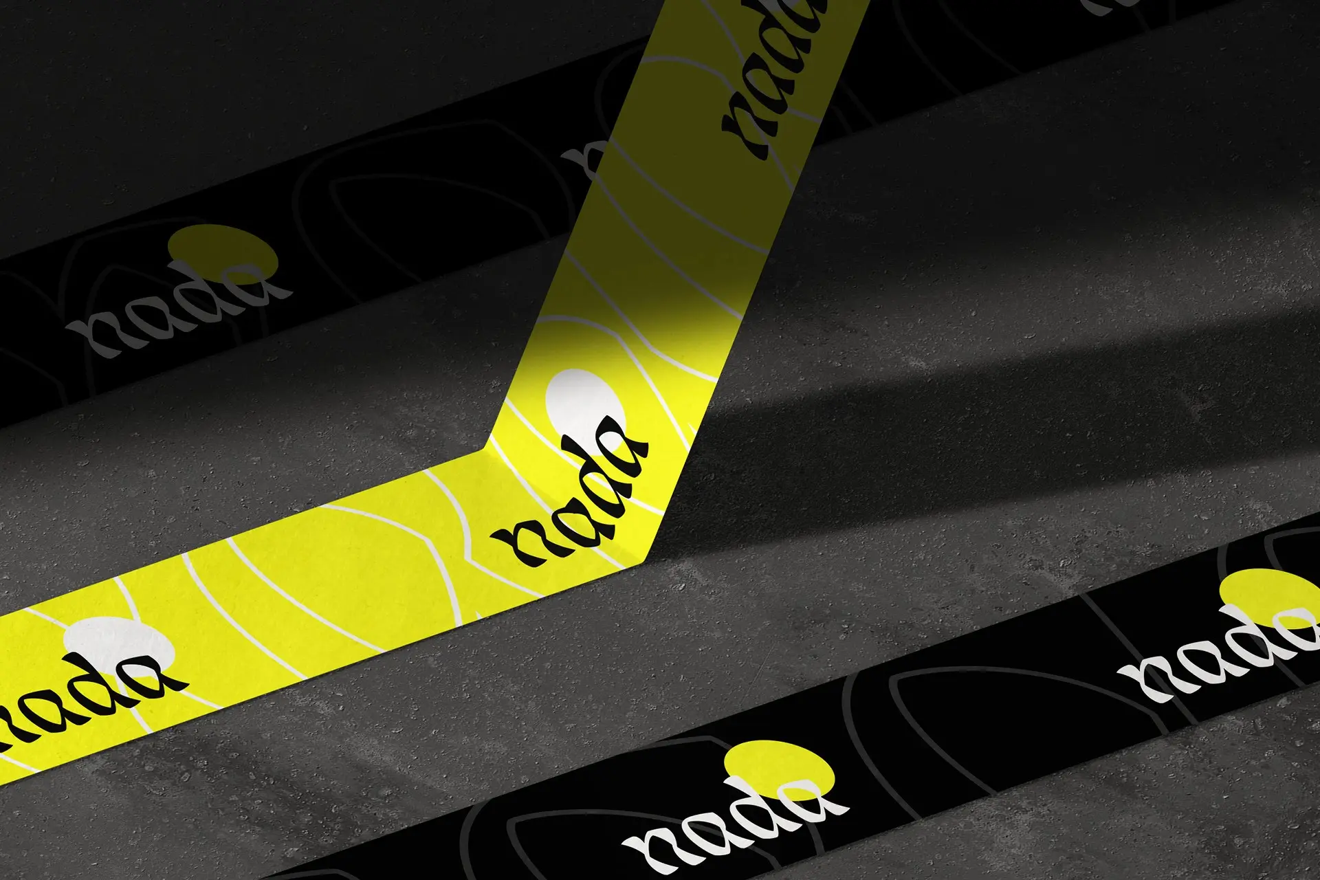
Identity for a booking, management and production agency working out of Brussels, with a roster that runs from Girls in Hawaii to Horse Lords. An agency of that kind signs a poster, it does not occupy it: a small wordmark and a yellow dot at the top, then the photograph takes the whole sheet.
A Films Ouverts
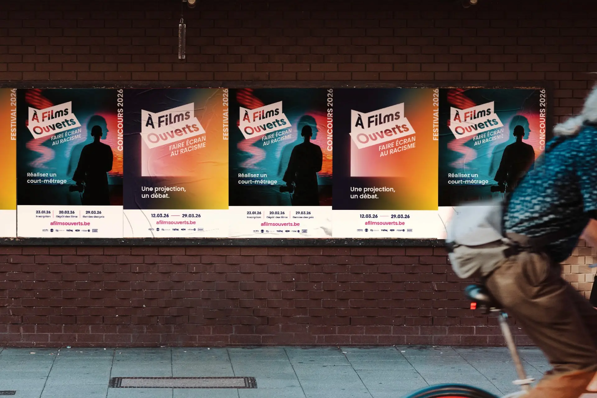
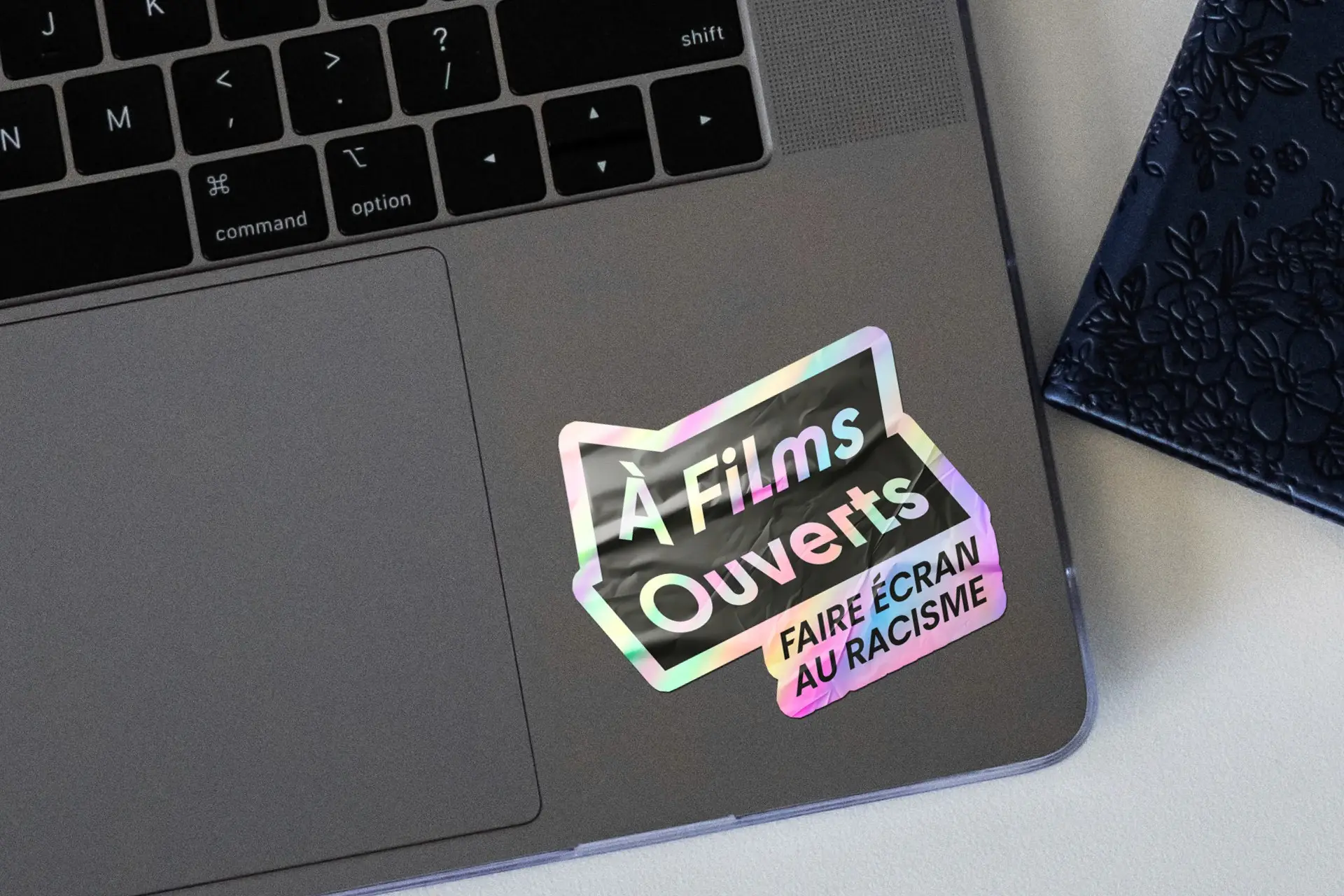
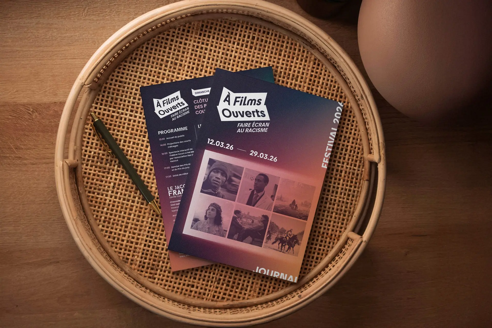
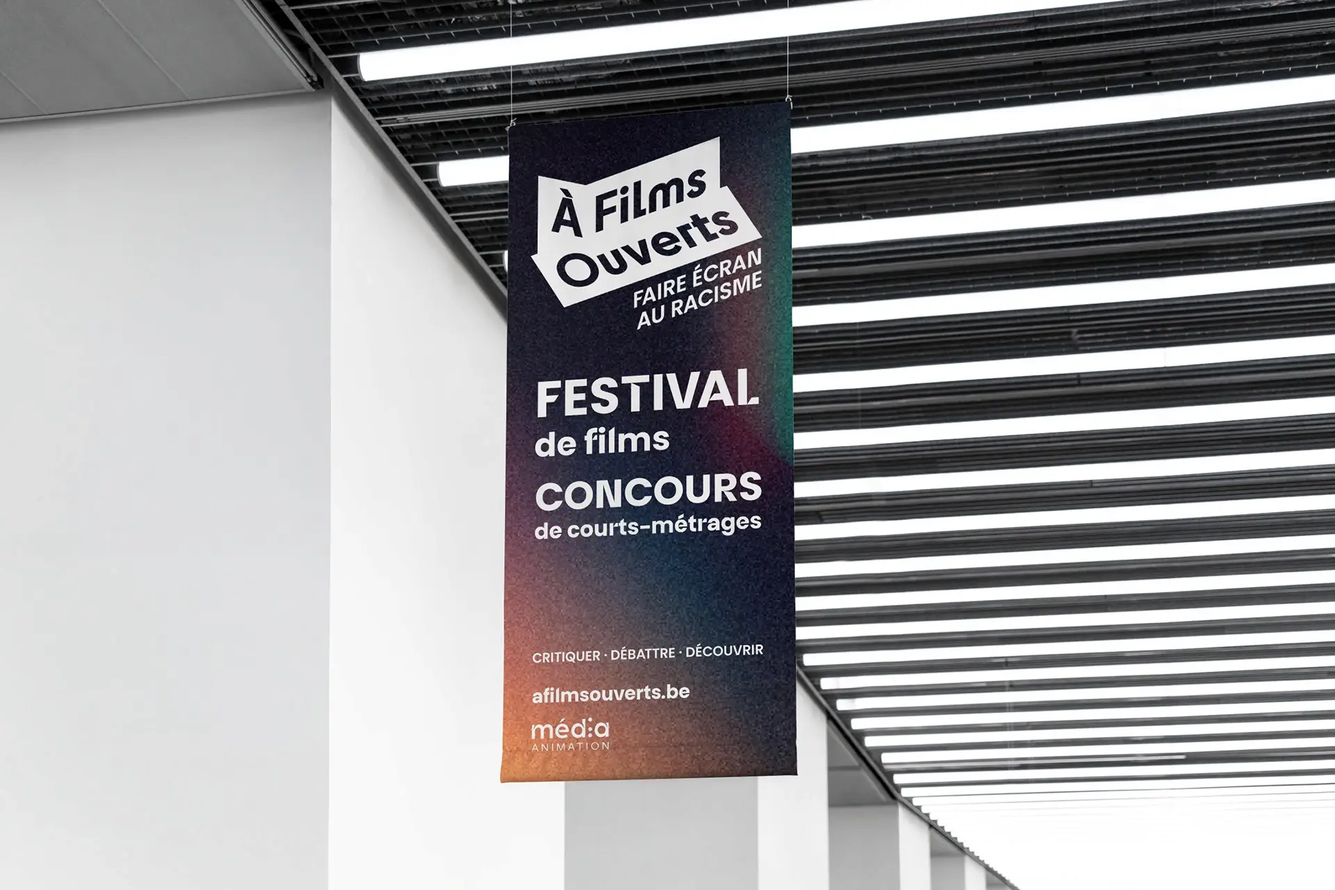
Identity and website for the festival run by Média Animation, a short film competition against racism screened around 21 March in some fifty venues across French speaking Belgium, each screening followed by a debate. The logotype sits on two strips of white paper laid over the image, a device any partner venue can reuse, so every edition changes its photography and stays recognisable.
Brin d’acier
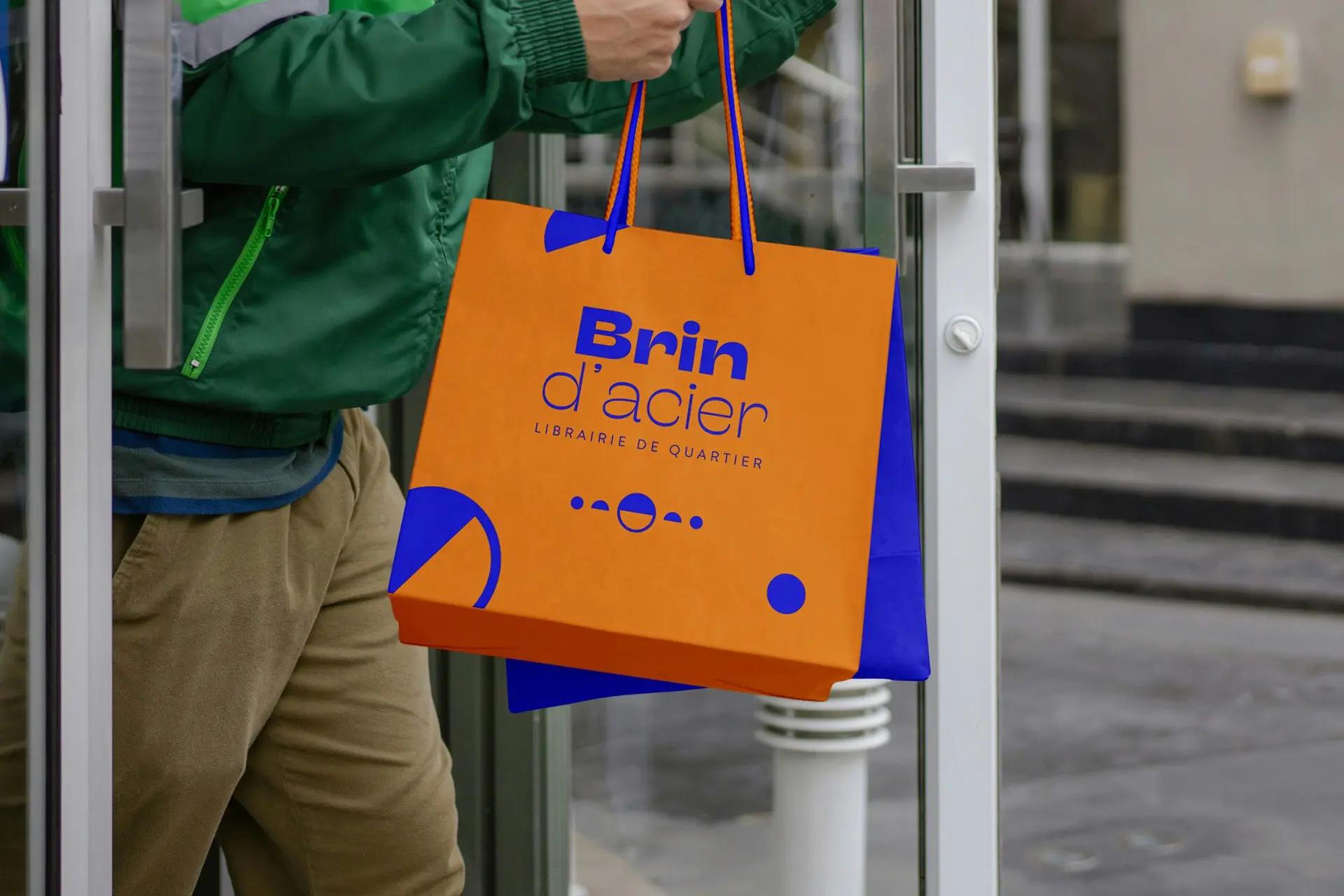
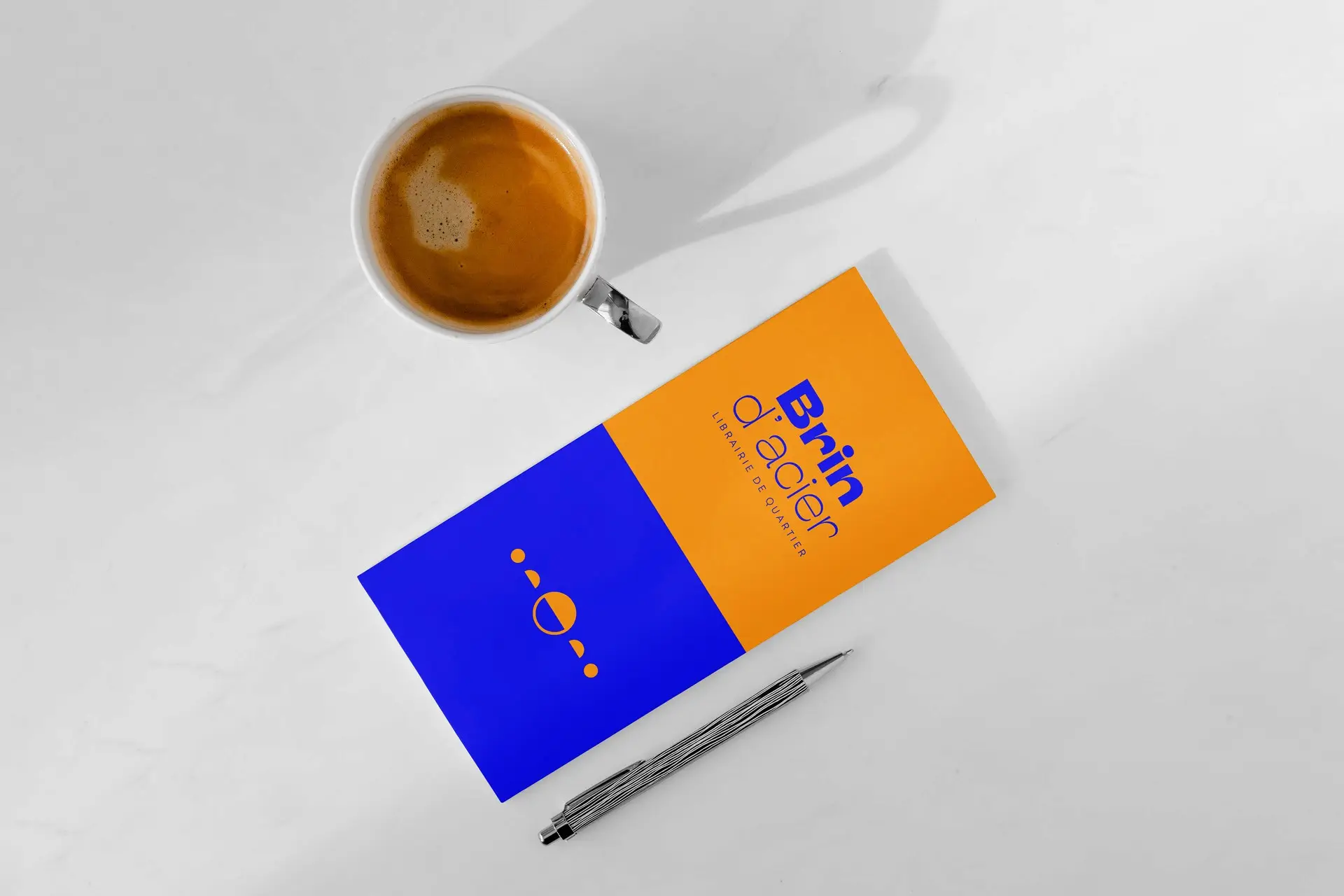
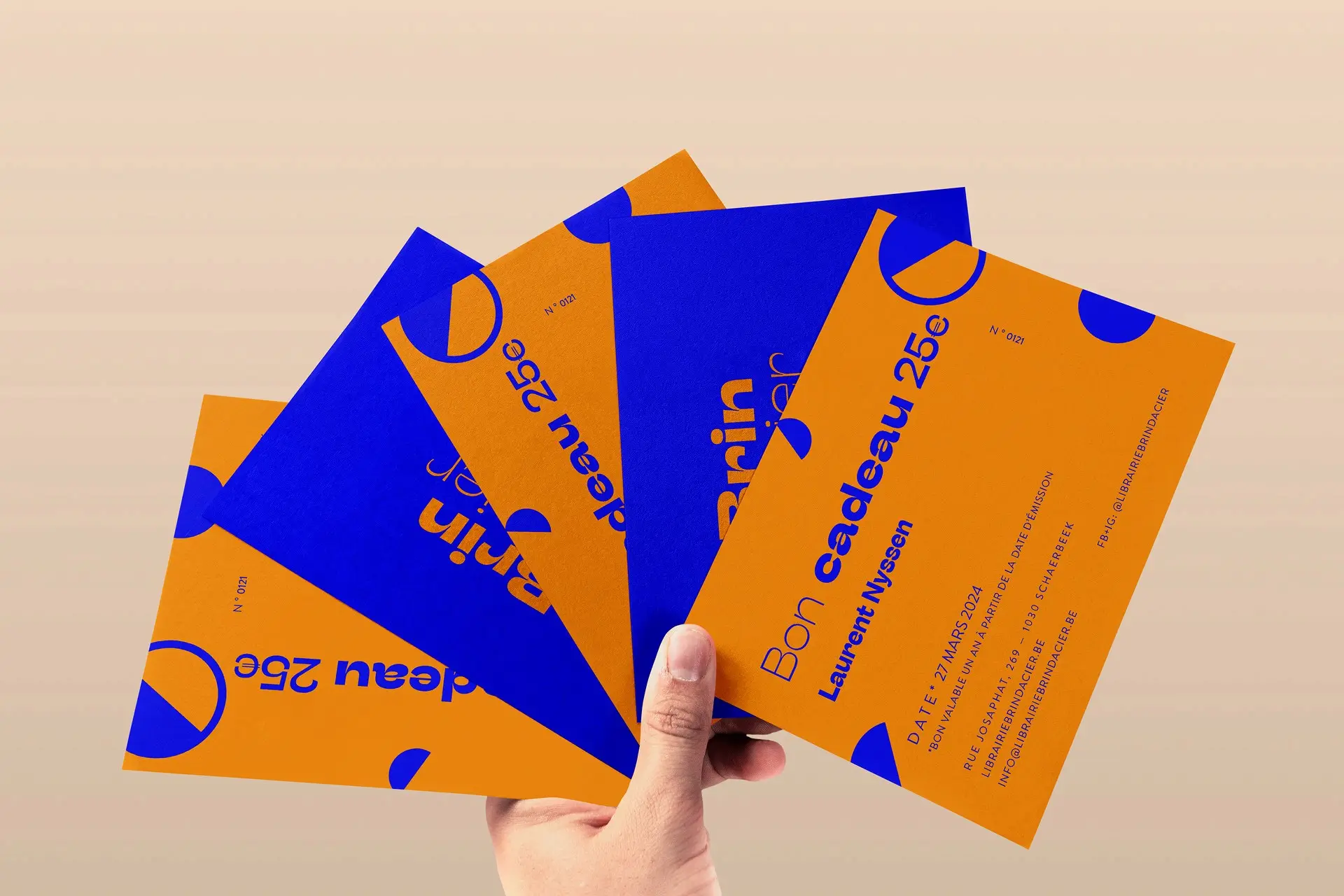
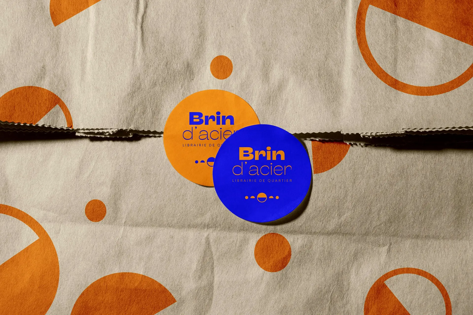
Naming, identity and online shop for a neighbourhood bookshop in Schaerbeek. The name puts something slender next to something hard, and the identity keeps that tension: orange against electric blue, a geometric sans, and a row of dots and half circles that reads as punctuation rather than ornament.
Psybru
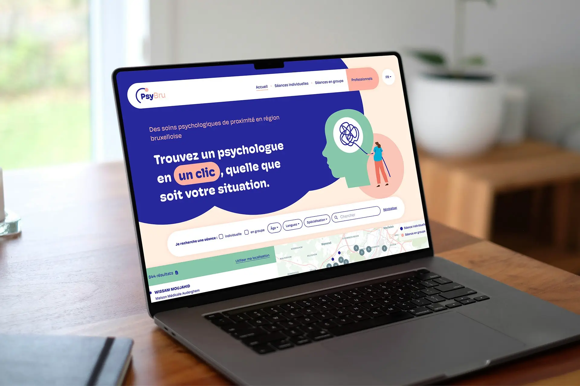
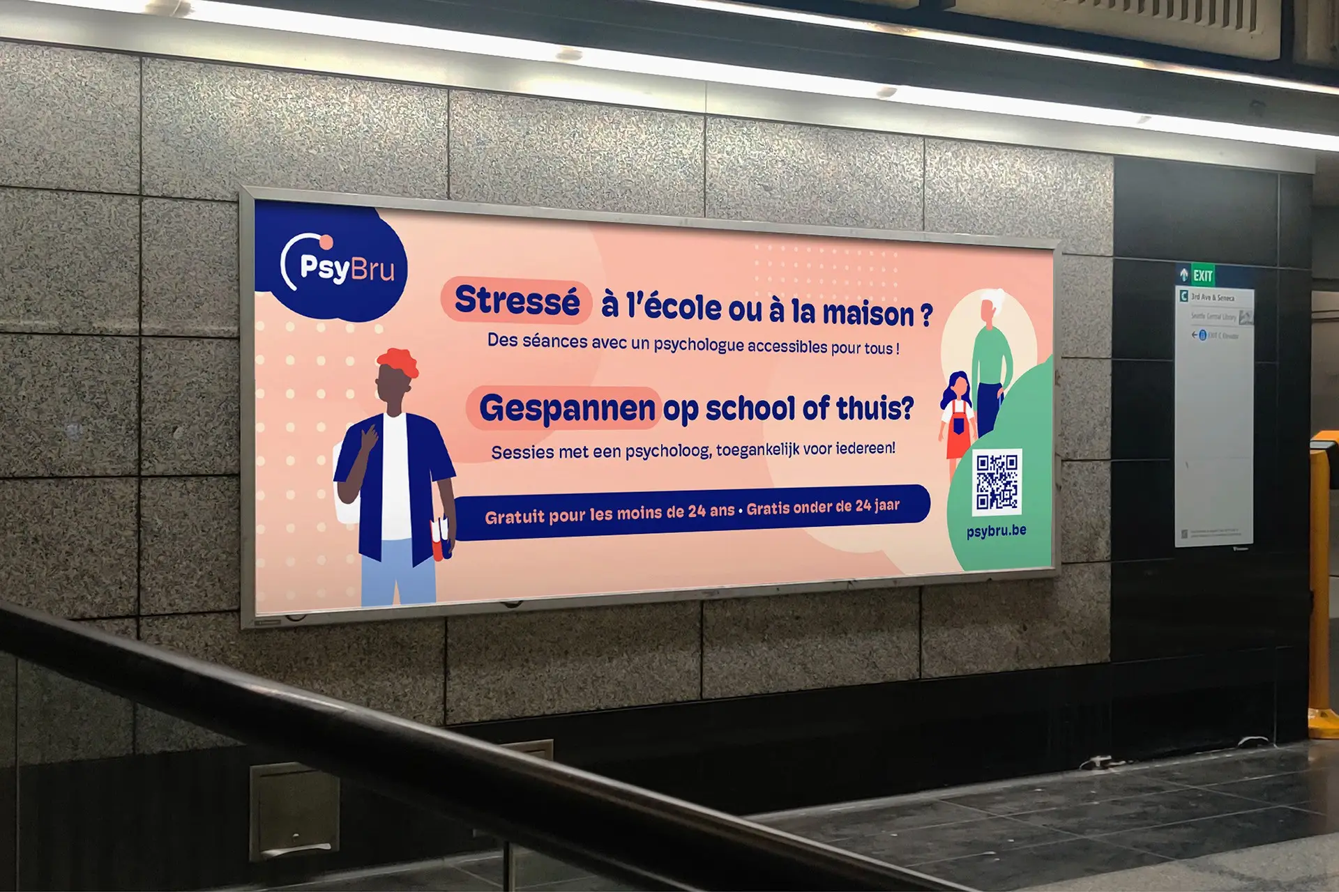
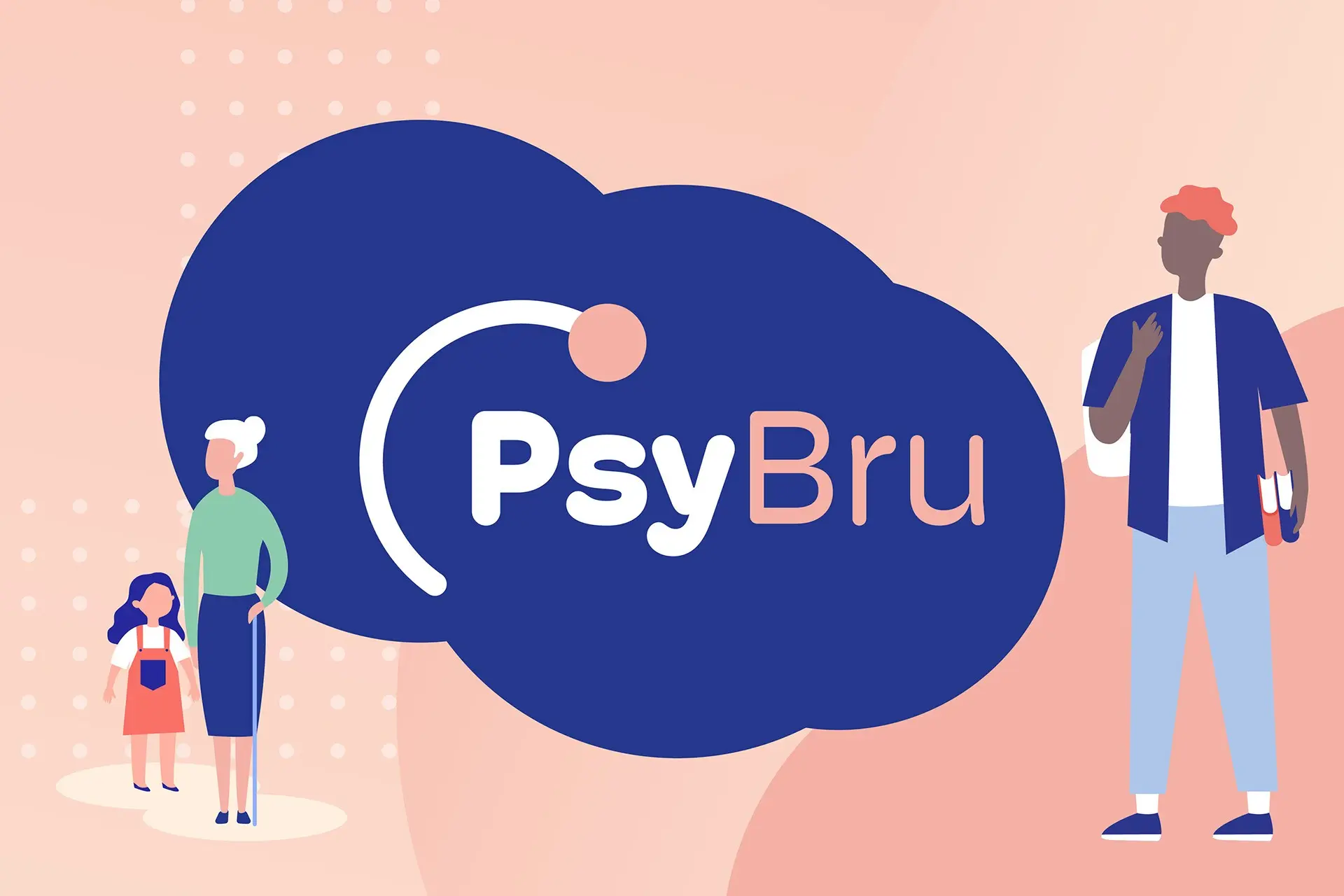
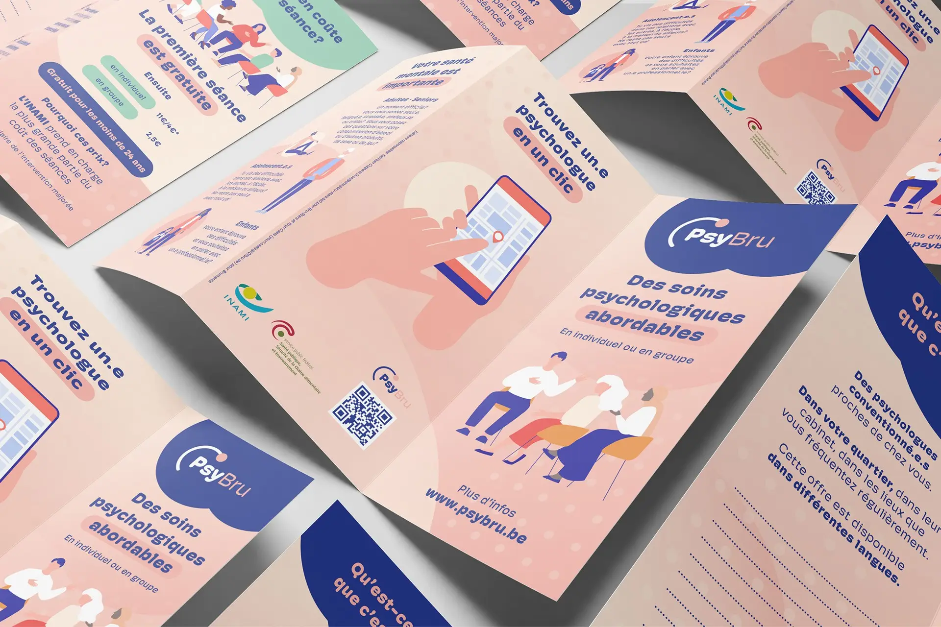
Identity and website for a directory of psychological care in the Brussels region: more than a thousand practitioners, filtered by age, by speciality and by the language you would rather be heard in. Everything went into clarity rather than character, because people arrive here in a bad week and need to find the right person in a few clicks.
ExAequo
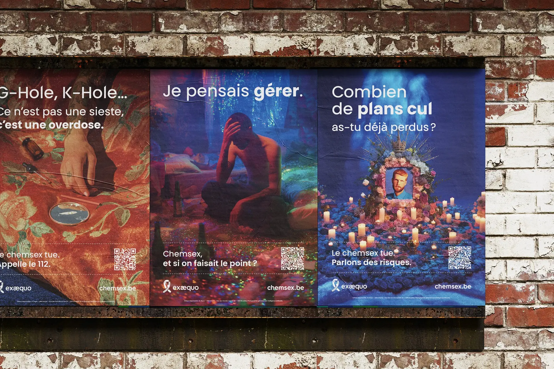
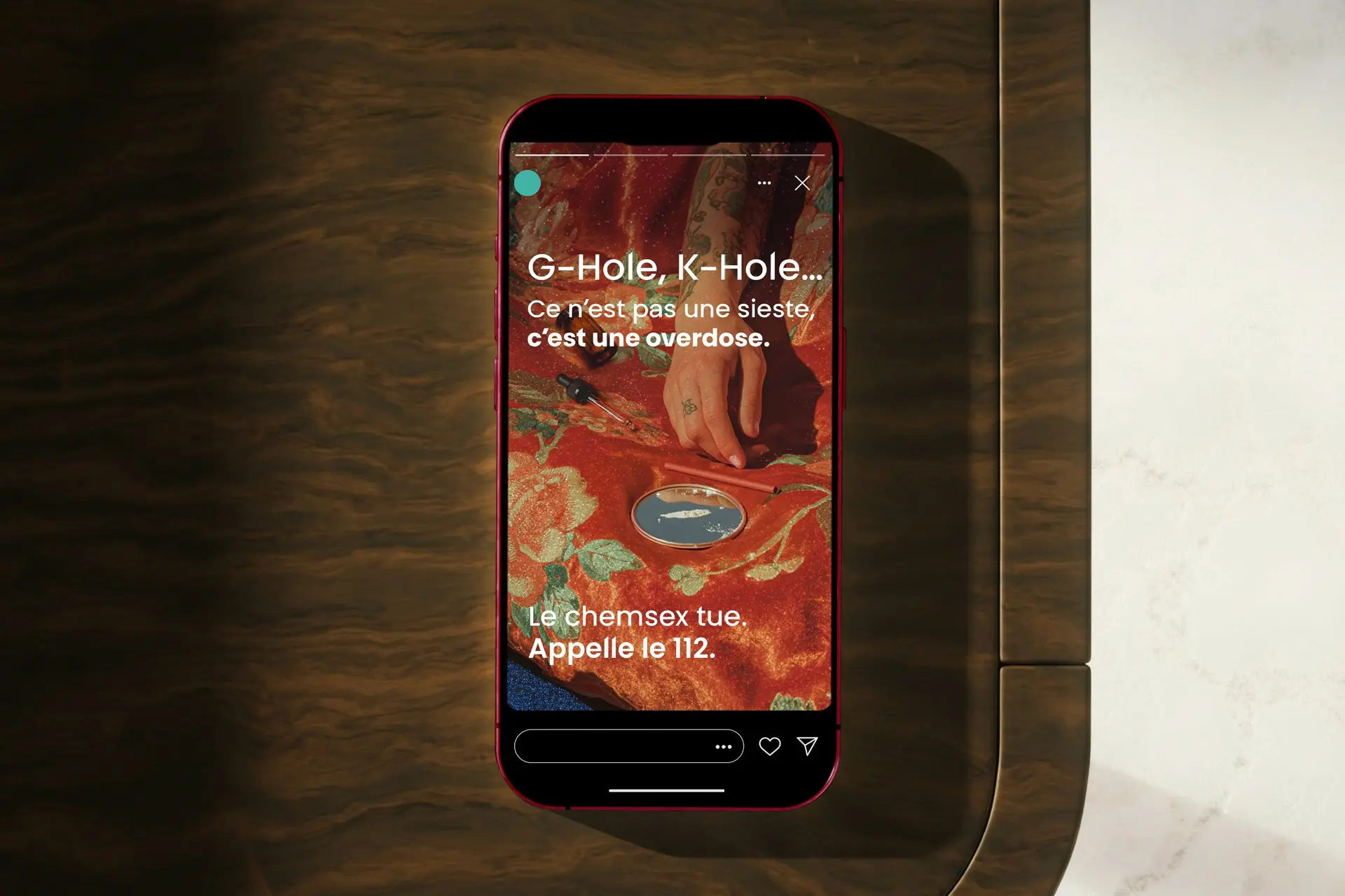
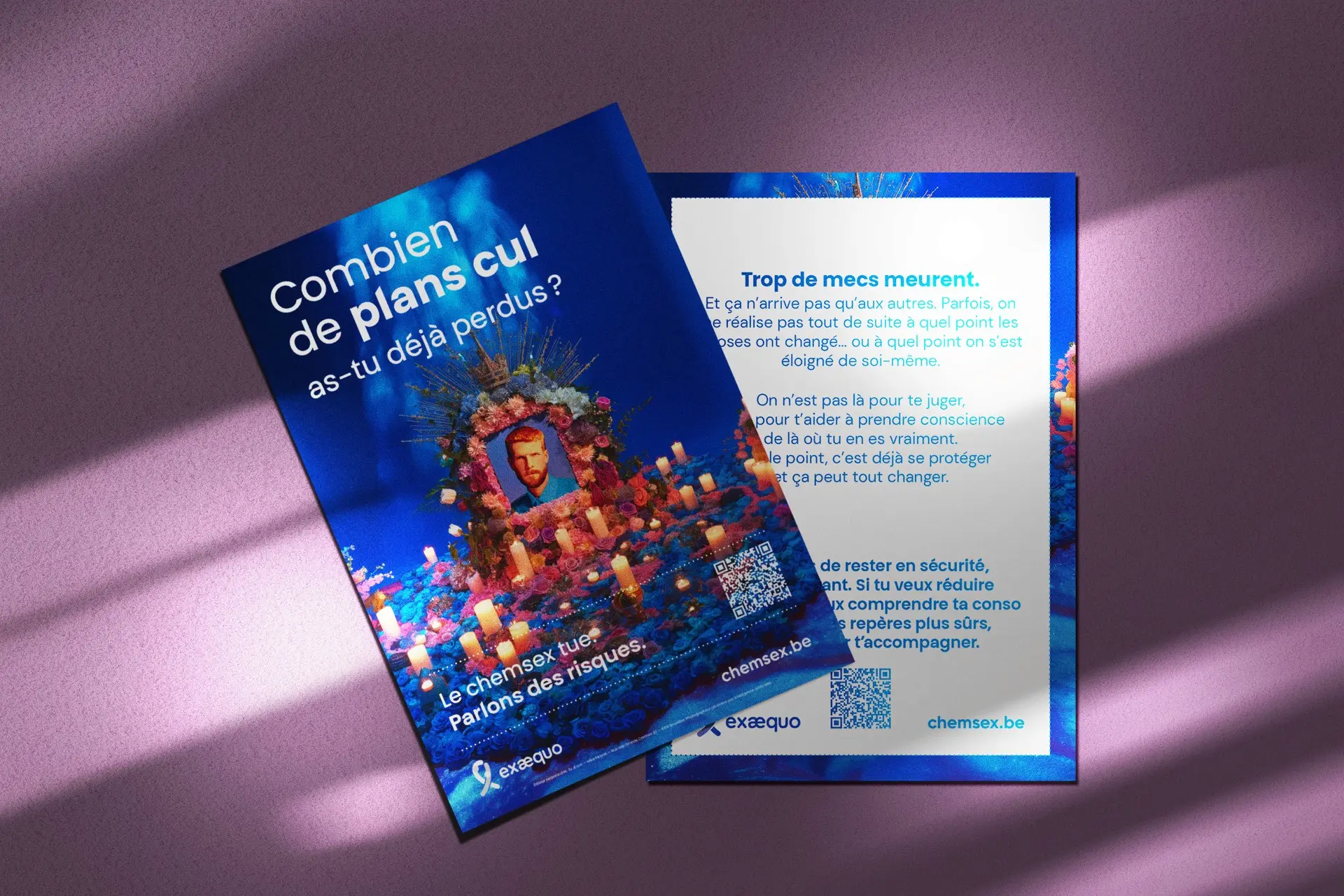
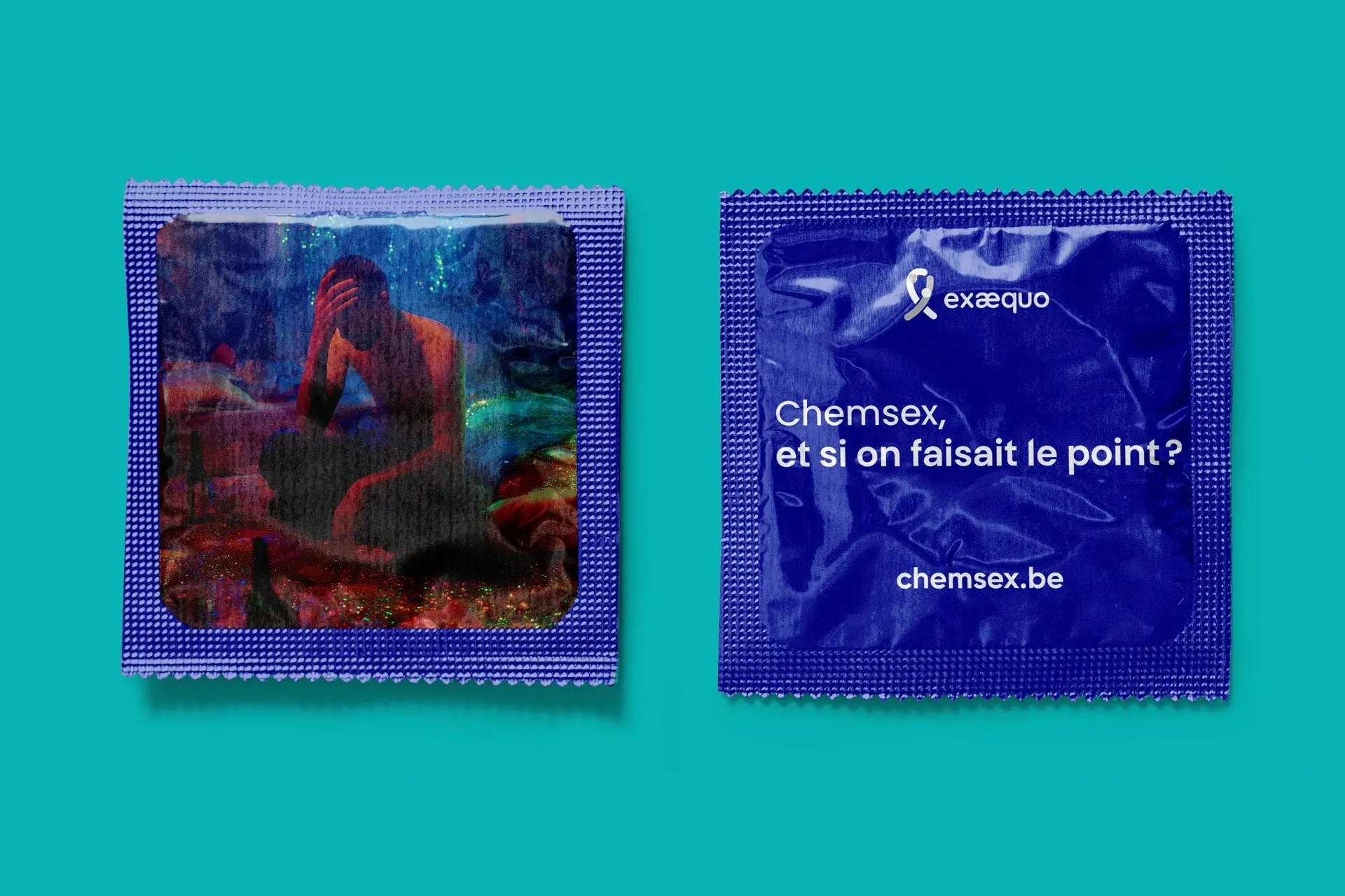
A harm reduction campaign on chemsex for Ex Æquo, a Brussels association working on sexual health and HIV prevention, run across street posters and a dedicated site. The photographs are generated by AI and credited as such in the small print, which let the campaign put a face and a room to scenes no one could reasonably be asked to pose for.
EmpreinteS
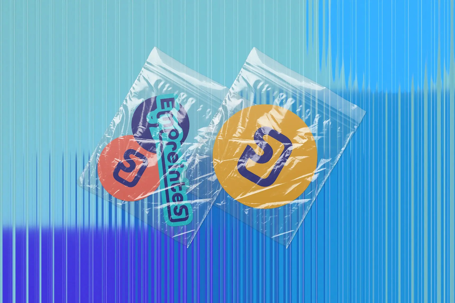
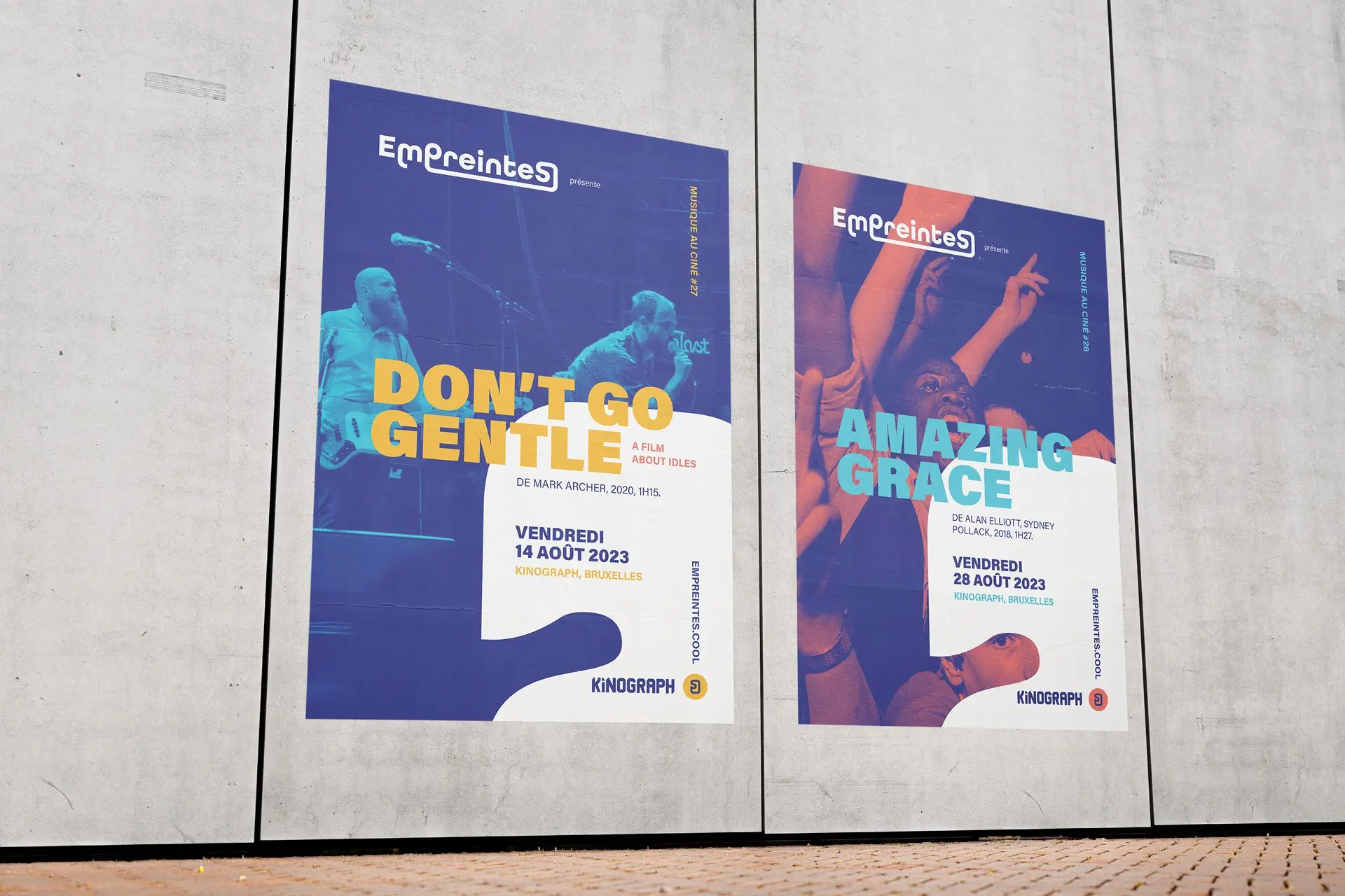
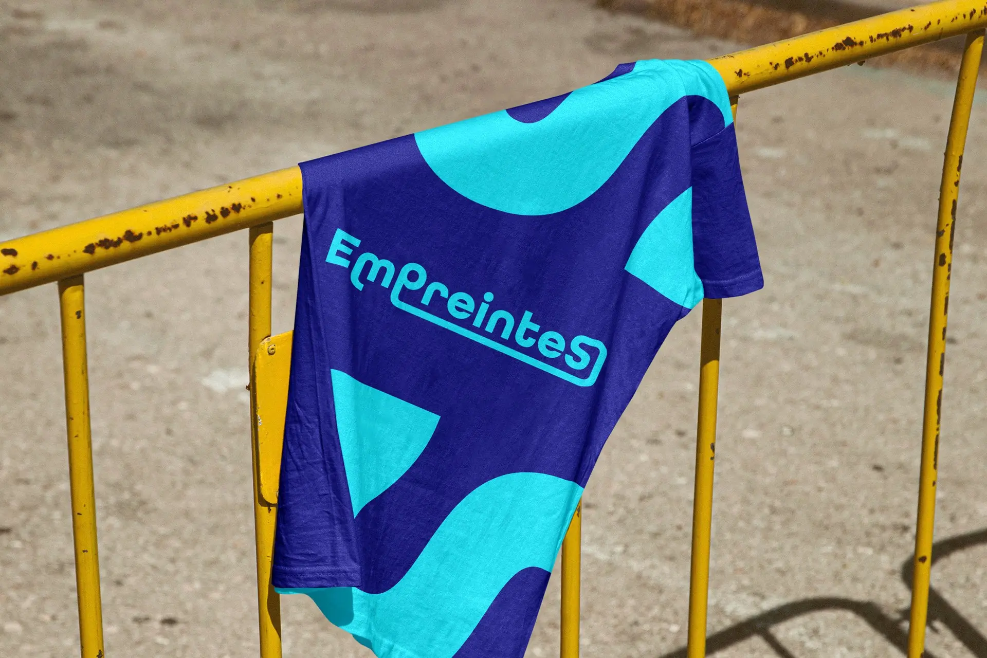
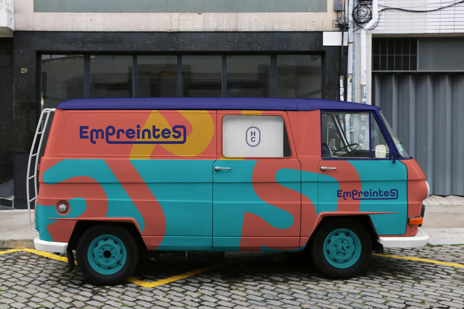
Identity for a travelling cinema that takes films to the people who cannot go to them: prisons, nursing homes, reception centres, hospital wards. The capital S at the end of the name is the whole idea, a trace is never the only one, and the mark redraws that S as a fingerprint whorl, a single circle that holds up on a sticker, a badge or the side of a van.
World Cocoa Foundation
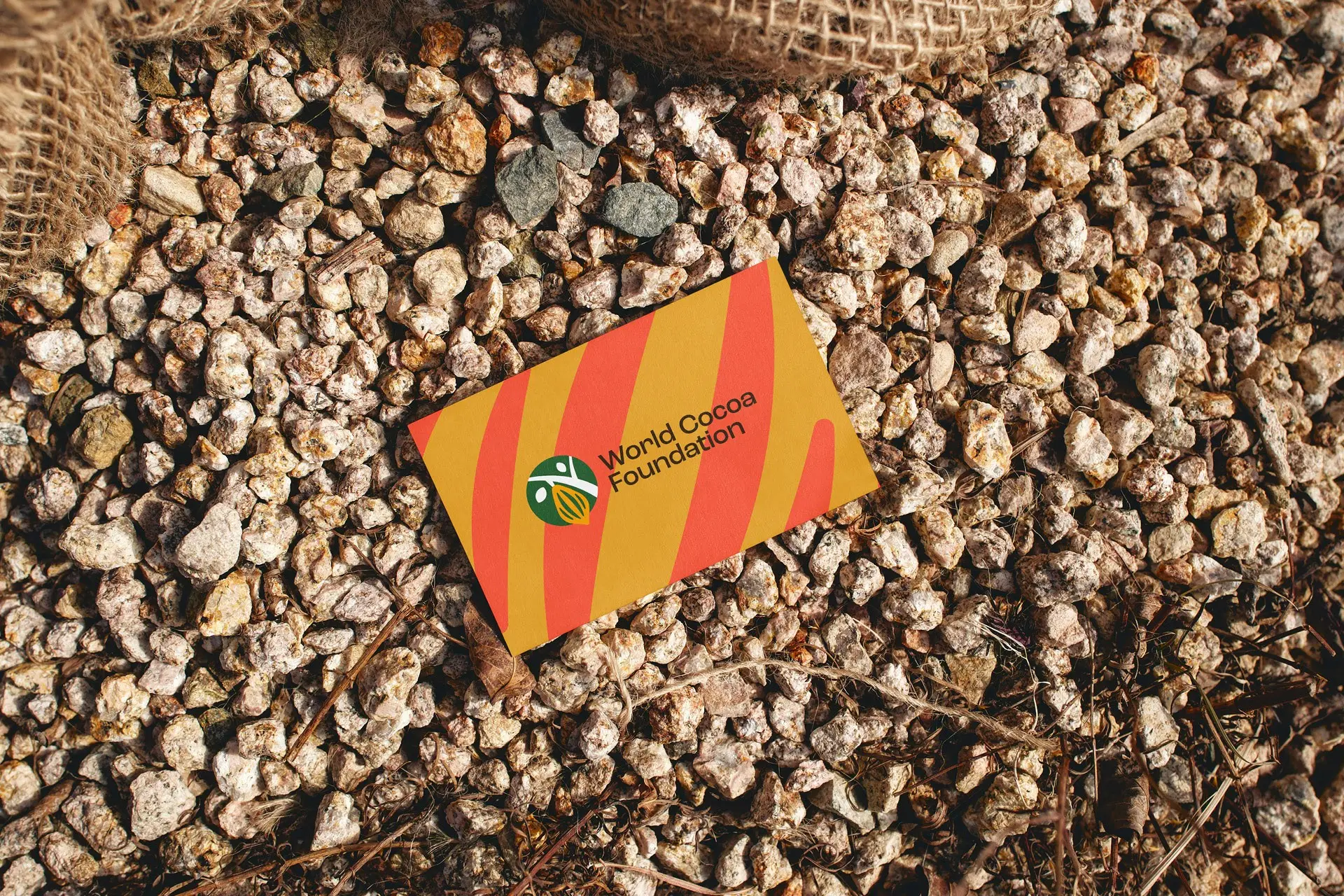
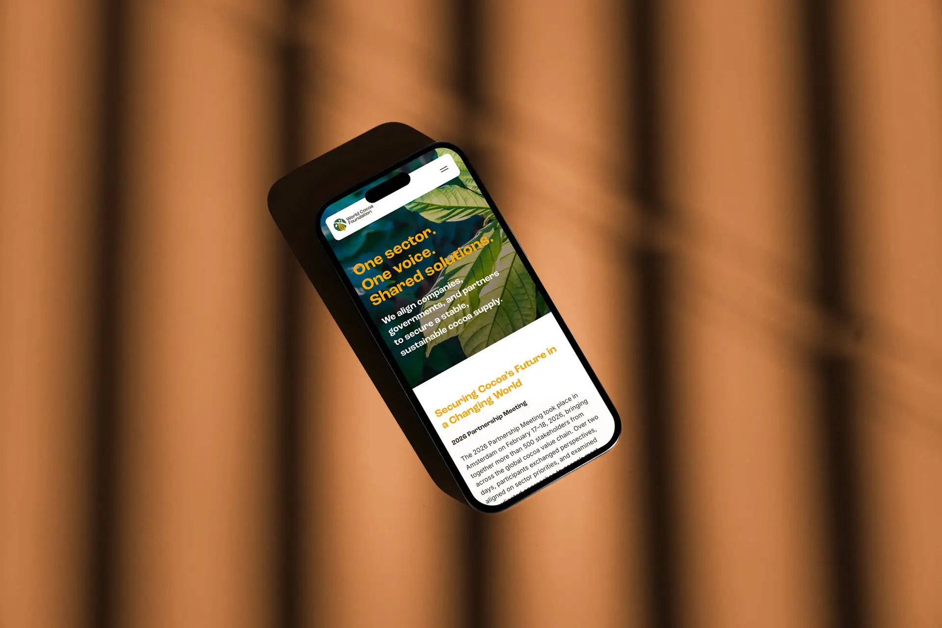
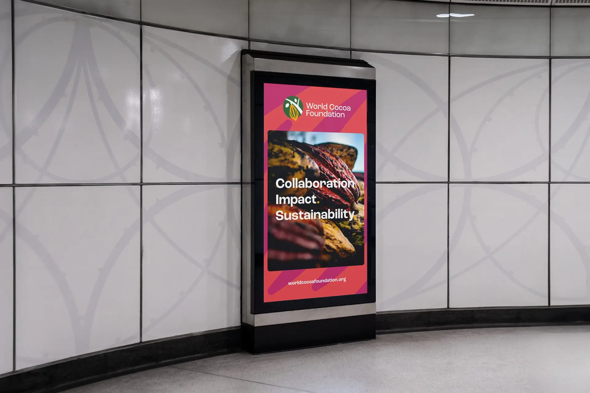
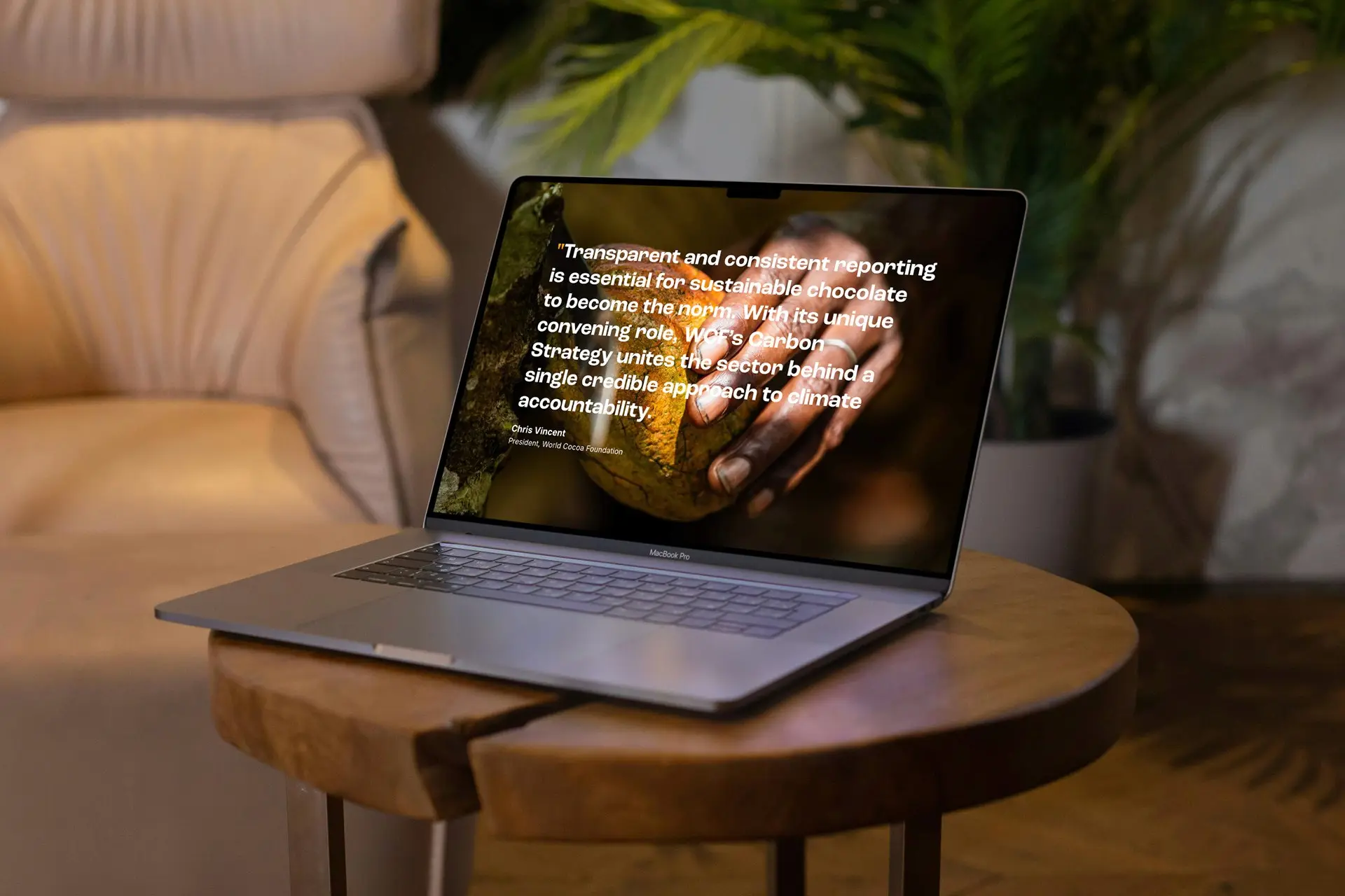
A rebrand for the membership organisation that brings the cocoa sector around one table, from farmer cooperatives to chocolate manufacturers. The mark puts a grower and a pod inside a single green roundel, and the pattern that carries the rest of the system is lifted from the ridges of the pod, so something of where the cocoa is grown survives into material that mostly lives in meeting rooms.
Silicones Europe
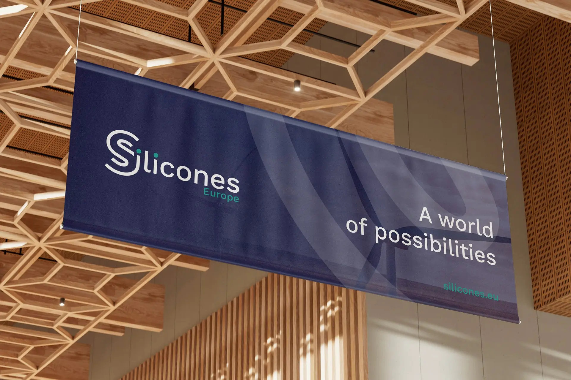
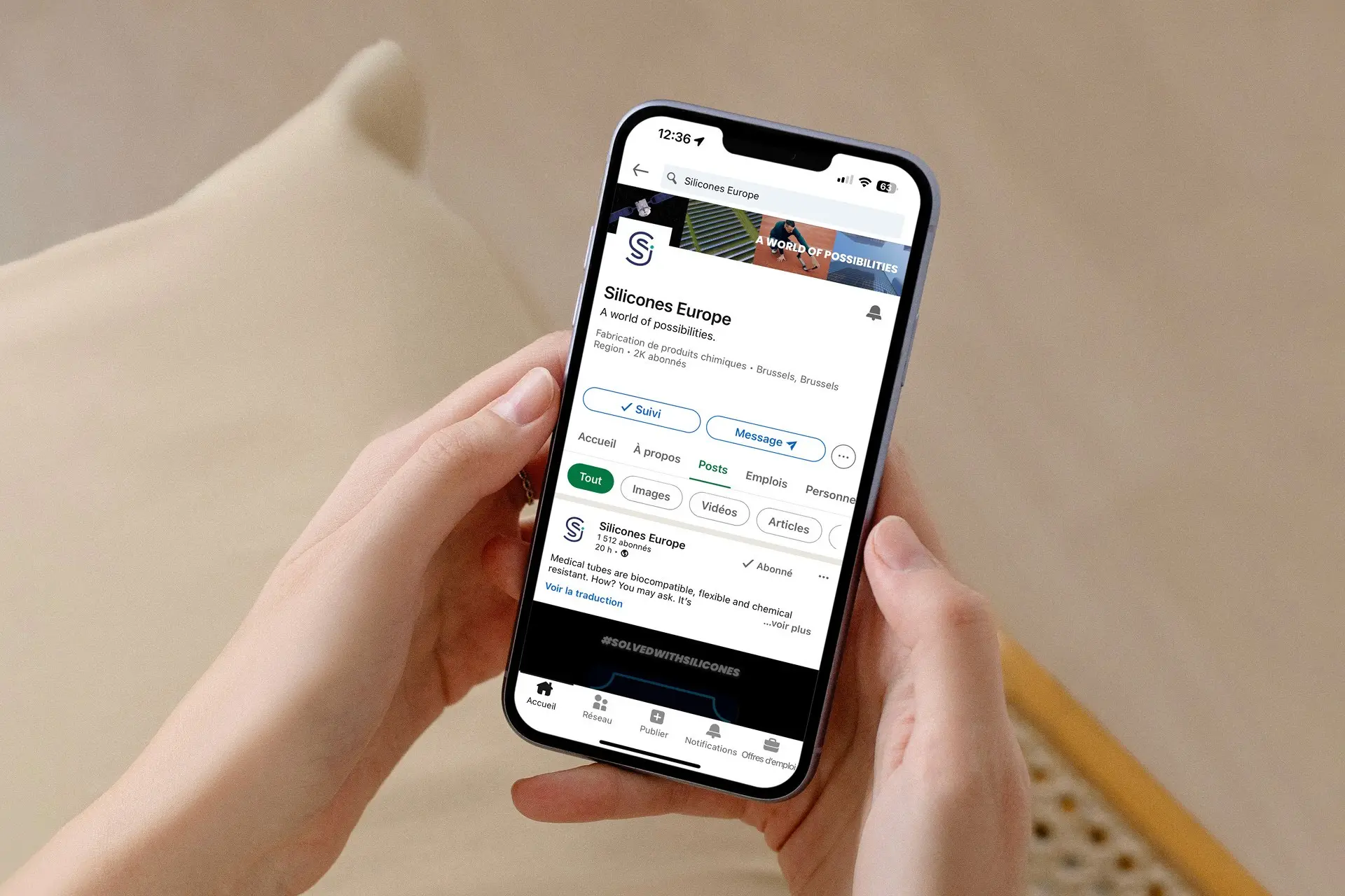
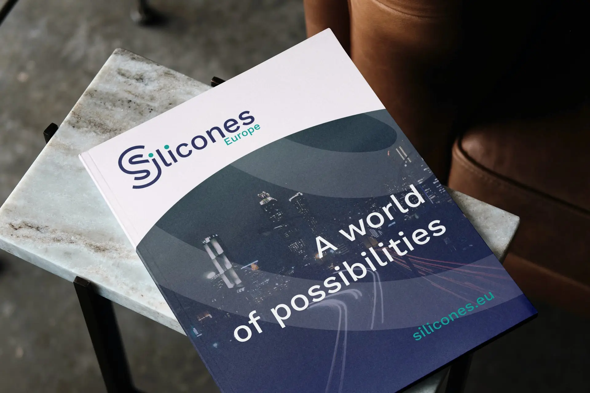
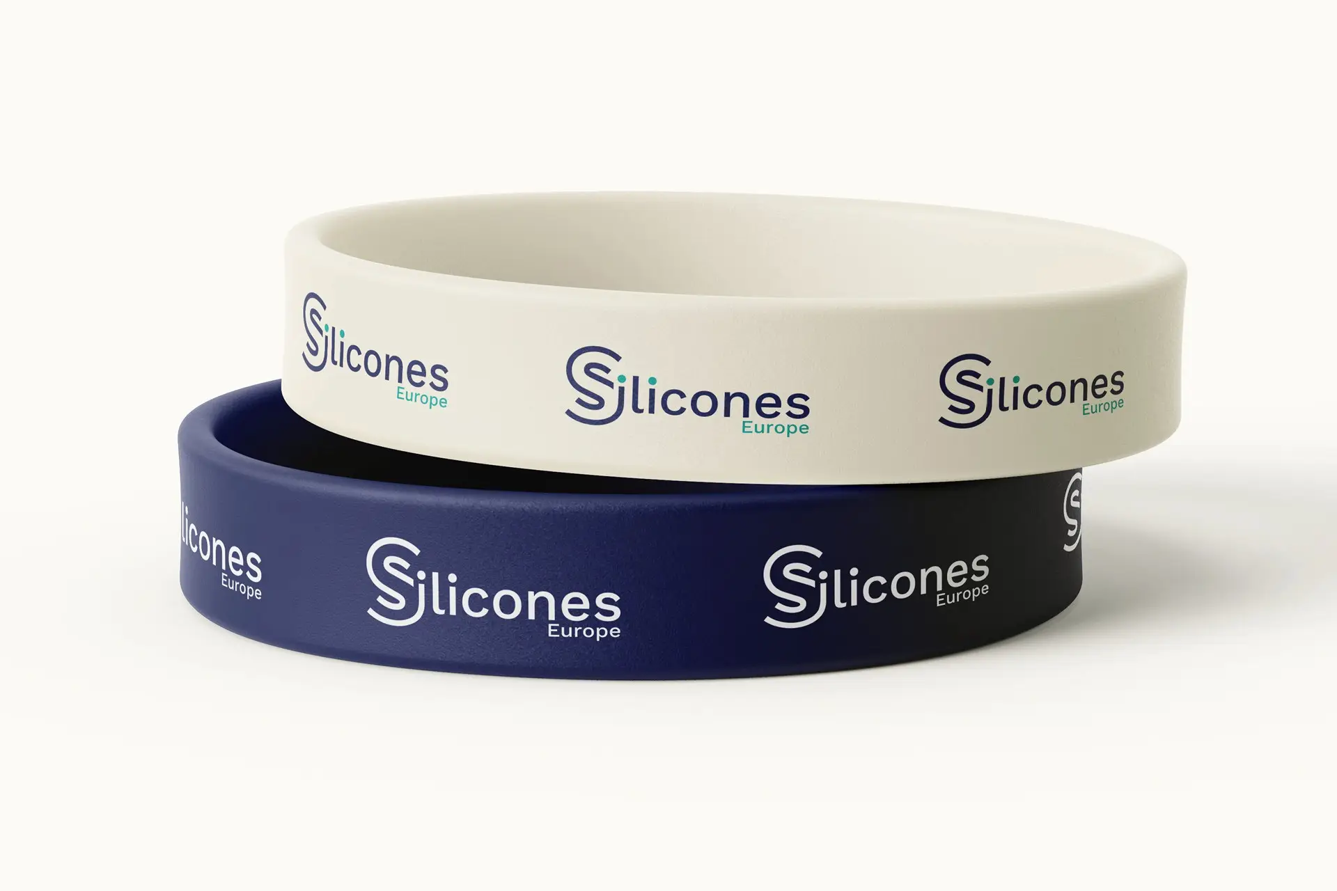
A rebrand for the Cefic sector group that speaks for Europe’s silicone and silane producers, carried through to signage and event material. The S is drawn as one looping strand, a nod to the polymer chain, and the line it sits under moves the conversation off the chemistry and onto what the chemistry makes possible.
LAB 65
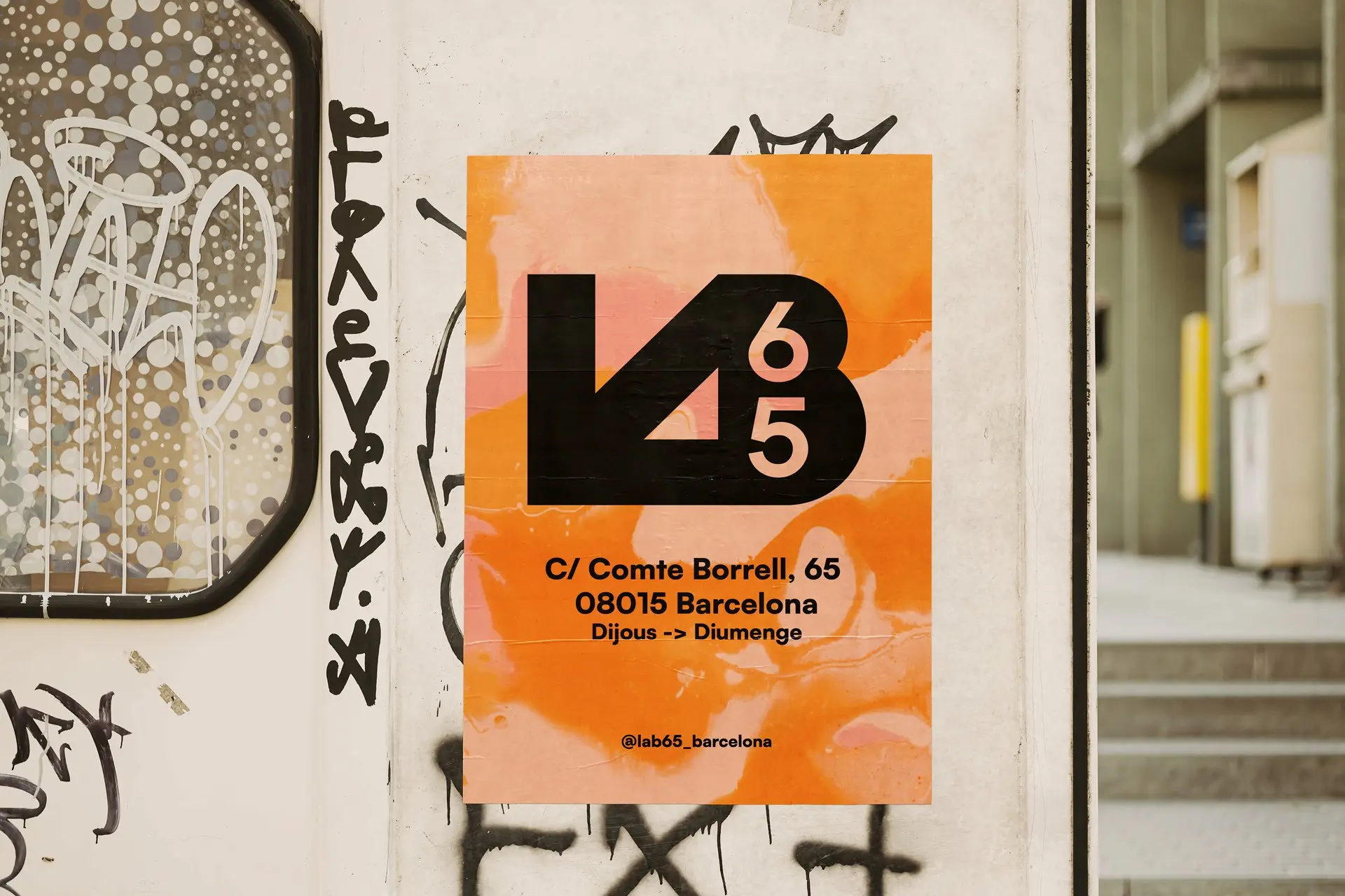
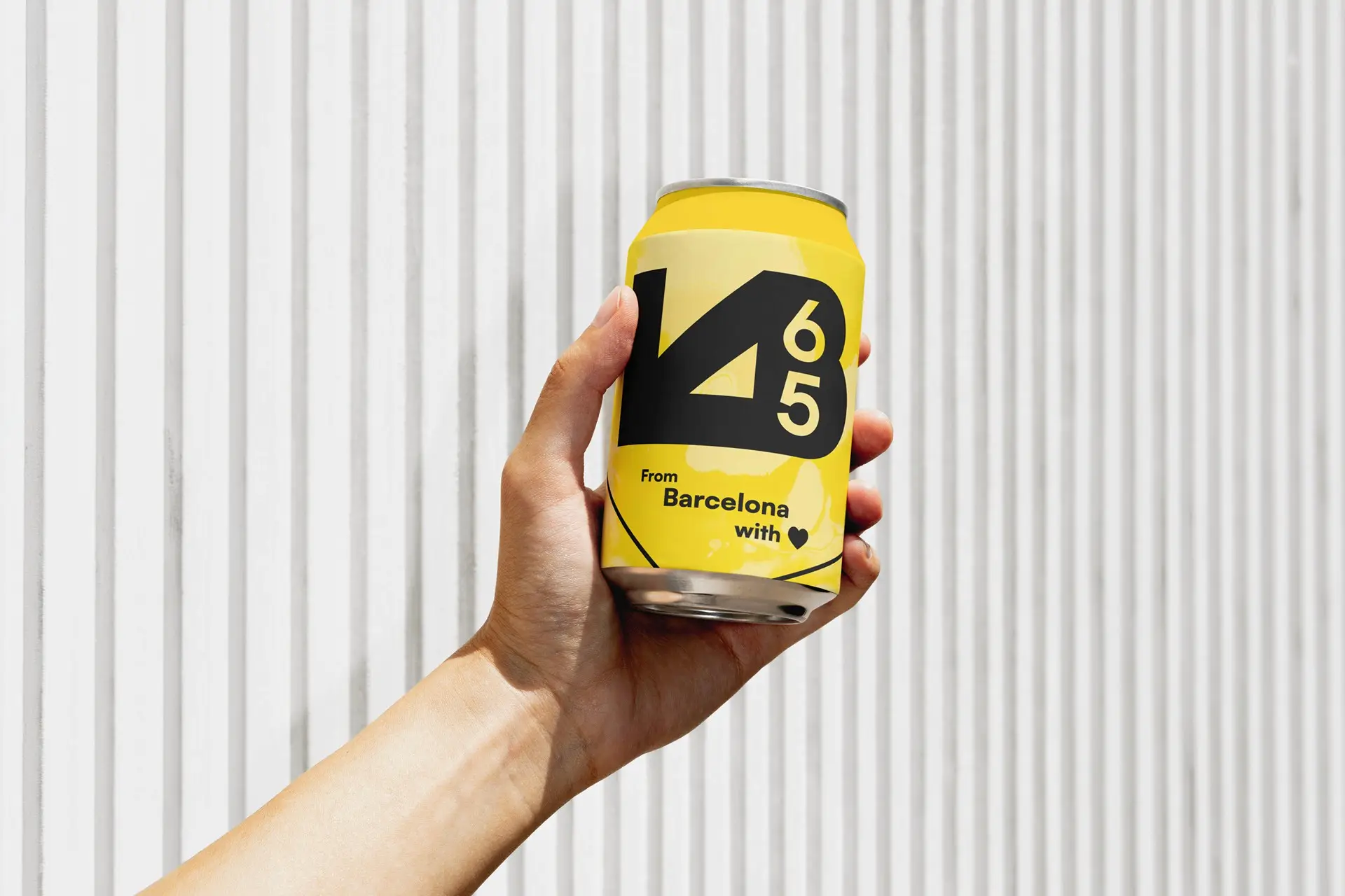
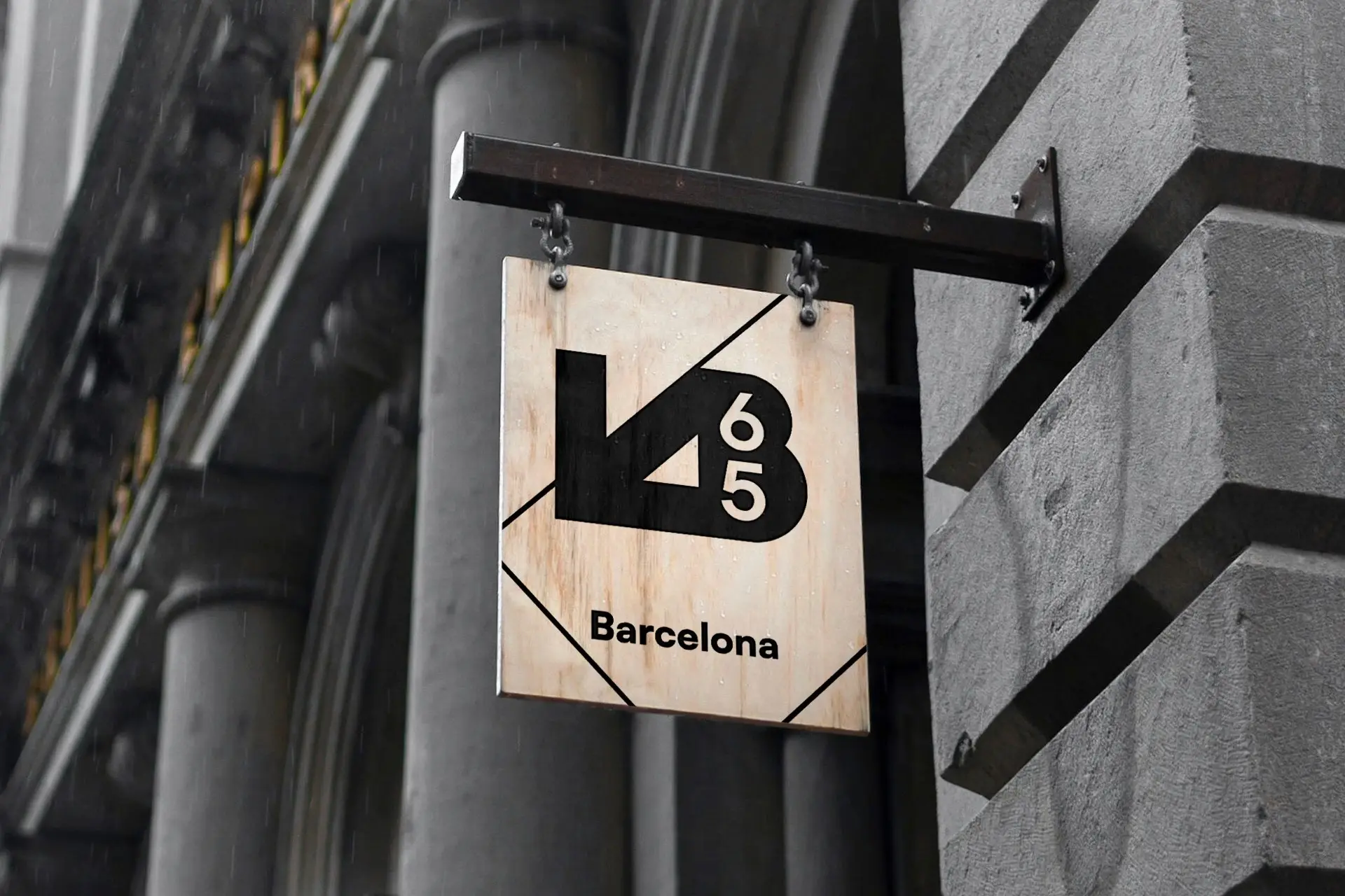
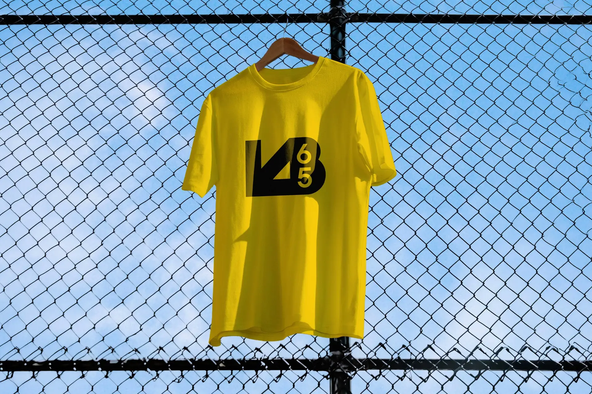
An identity for a Barcelona record shop and cultural association that took its street number for a name. The mark folds the L, the B and the number into a single black block, sized to be fly posted on a wall and still read from the other side of the road.
Music Stuff
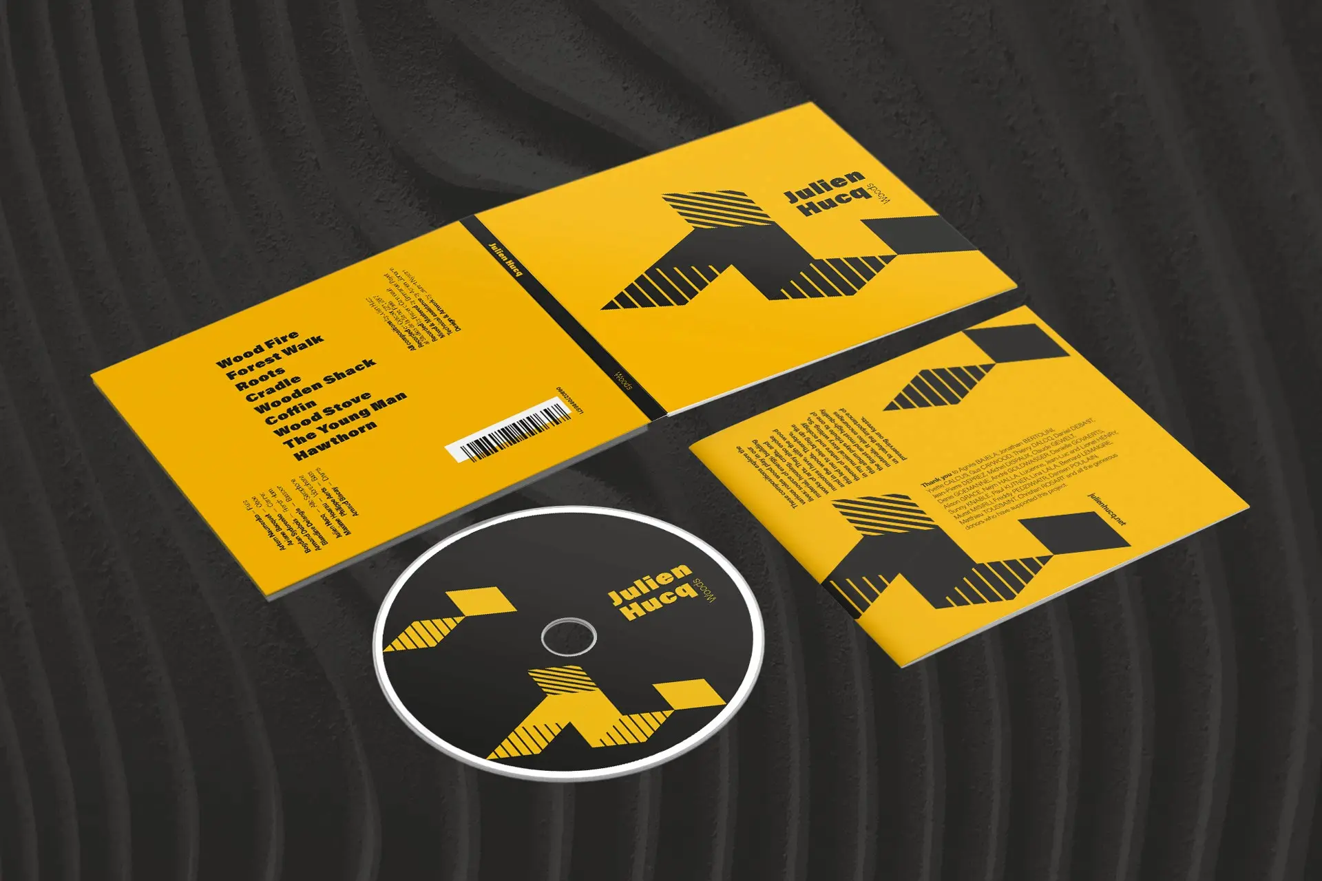
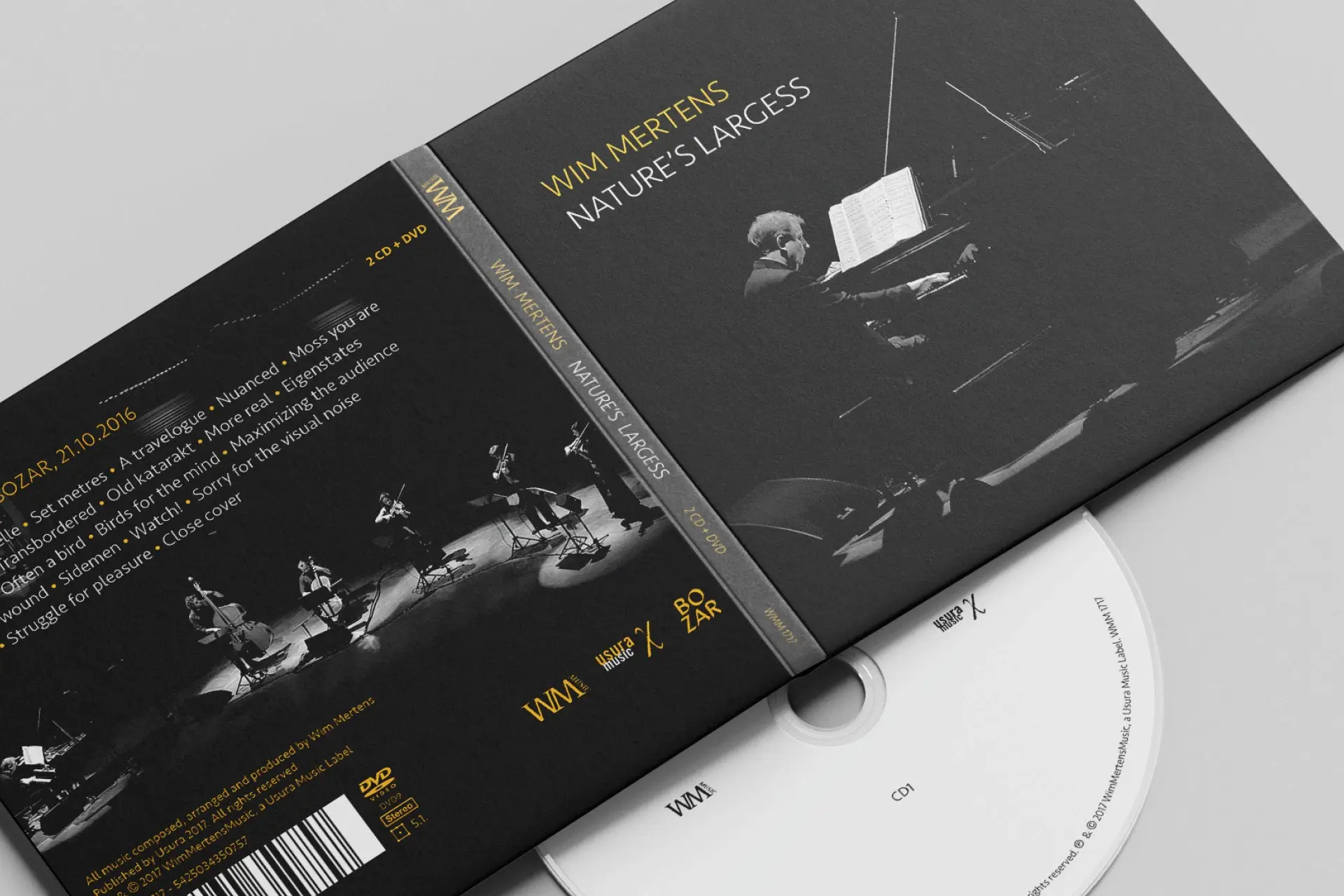
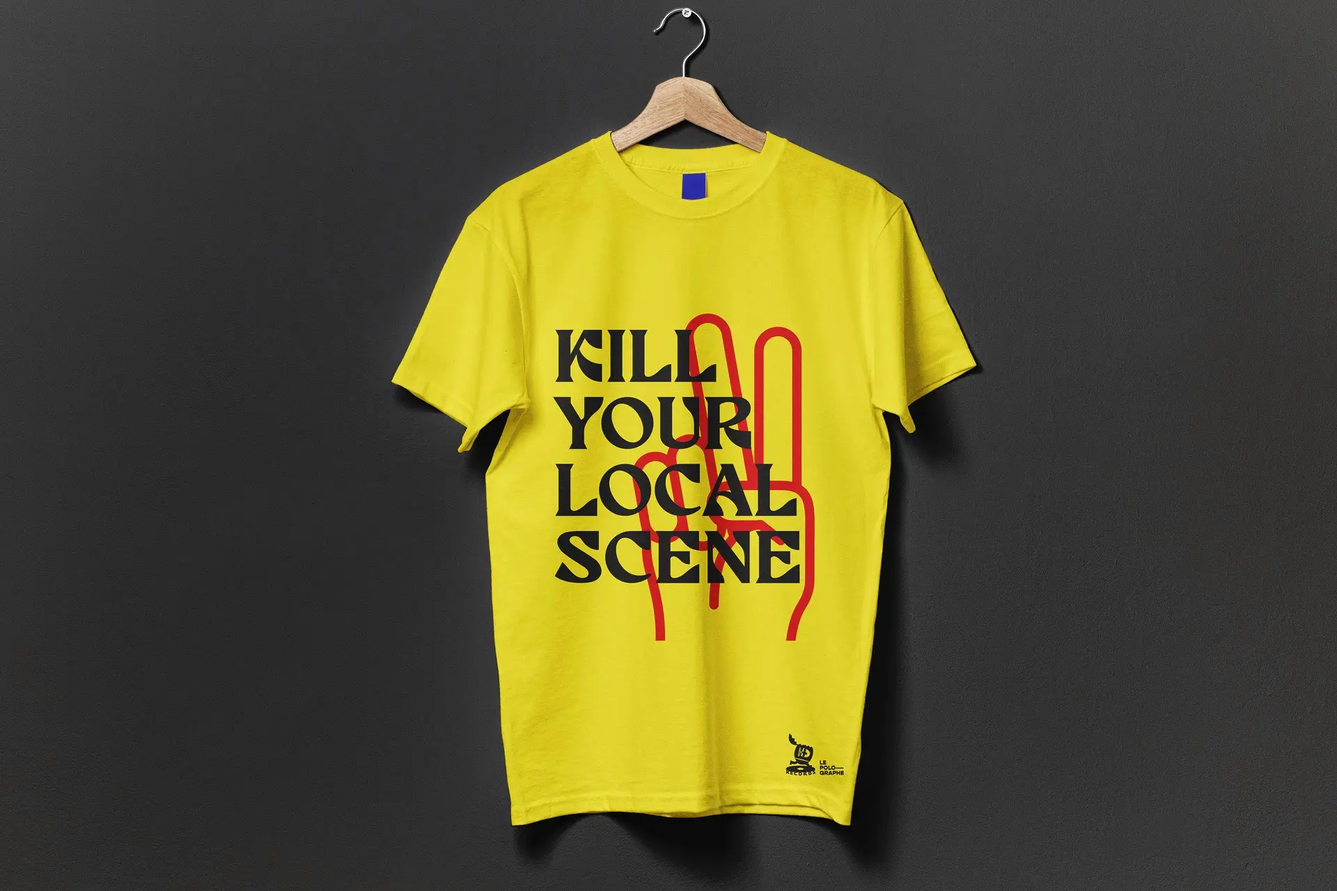
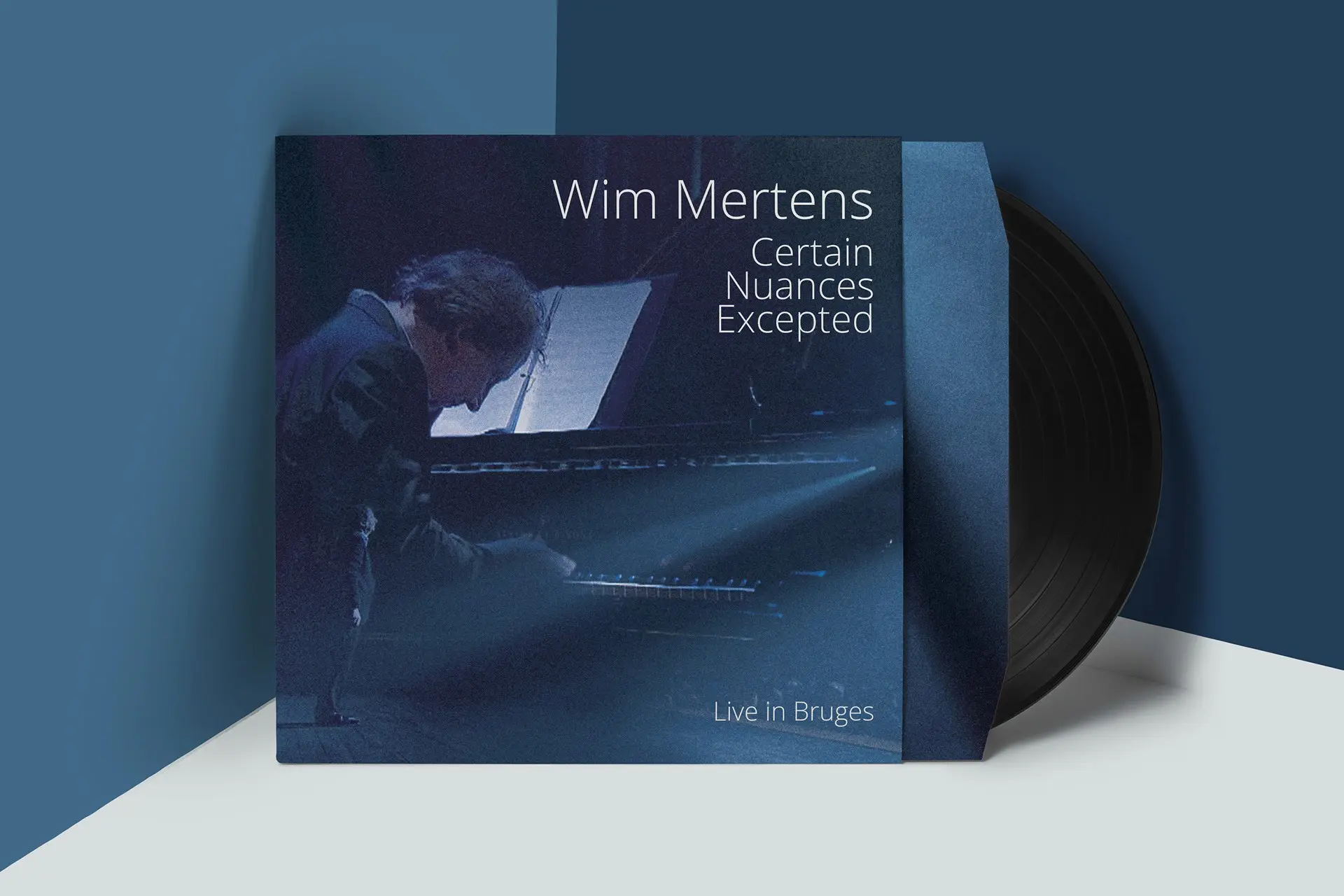
Sleeves, covers and record artwork made over the years for musicians, labels and friends. No brief, no client, no strategy deck: this section exists because it is where a good share of the ideas start.